

Every second, thousands of shoppers land on e-commerce websites and make a split-second judgment. They either stay or they leave. And most of the time, that decision has nothing to do with your product. It has everything to do with your design.
The best e-commerce web design does something most people underestimate. It removes friction. It builds trust before a single Word is read. It guides a visitor from curiosity to checkout so smoothly that the process feels effortless, almost invisible. That is not an accident. That is intentional, strategic design built on proven principles.
Yet most online stores get this wrong. They focus on looking good rather than performing well. They copy trends without understanding the psychology behind them. They launch beautiful websites that quietly bleed conversions every single day.
This guide changes that.
Whether you are building your first online store, redesigning an existing one, or working as a designer crafting ecommerce experiences for clients, what you will find here are the ecommerce web design best practices that actually move the needle. Not theory. Not outdated advice recycled from a 2018 blog post. Real, current, and actionable principles drawn from what the best ecommerce web designs in the world consistently get right.
By the time you finish reading, you will know exactly what separates a high-converting ecommerce website from one that simply exists, and more importantly, you will know how to build or commission one that performs.
Let us get into it.
What is E-commerce Web Design? (And Why It Makes or Breaks Your Store)
E-commerce web design is the art and science of building online shopping experiences that convert visitors into buyers. It goes far beyond choosing colors, fonts, or arranging product images on a page. At its core, e-commerce web design is about making every element of your website, its layout, speed, navigation, messaging, and flow, work together to serve one goal: turning interest into action.
It is the discipline that decides how easy it is to find a product, how much a visitor trusts your brand before they ever read a review, and whether someone completes a purchase or abandons their cart at the last step. In short, your design is your storefront. And just like a physical store, a poorly designed one drives people away, silently and consistently.
The Difference Between a Good E-commerce Site and a Great One
A good e-commerce site works. It loads, it displays products, and it has a checkout. A great e-commerce site wins repeatedly and predictably.
The difference is rarely about aesthetics. Great e-commerce web design is built around the customer’s mental journey. It anticipates questions before they are asked. It removes doubt at exactly the right moment. It makes the path to purchase feel natural rather than forced.
A good site gives visitors information. A great site gives them confidence. And confidence is what drives people to enter their card details and click “Buy Now”, especially from a brand they have never purchased from before.
How Design Directly Impacts Conversion Rates, Trust, and Revenue
Design is not a department. It is a revenue driver, and the numbers back this up.
Visitors form an opinion about your website within milliseconds of landing on it. That first impression is driven entirely by visual design, load speed, and layout clarity. If any of those elements feel off, the visitor registers distrust, often without being able to explain why, and leaves.
Trust is the invisible currency of e-commerce. Shoppers cannot touch your product, look you in the eye, or walk out with their purchase in hand. Everything they feel about your brand in that moment comes through the screen. A cluttered layout, an unclear value proposition, or a checkout process with too many steps all quietly erode that trust, and your revenue along with it.
On the flip side, a well-executed e-commerce web page design can dramatically increase conversion rates, boost average order value, and reduce return rates by presenting information more clearly and building confidence more effectively at every touchpoint.
Key Principles That Define the Best E-Commerce Web Designs Today
The best ecommerce websites in the world, regardless of industry or price point, share a set of core design principles that consistently drive results.
Clarity over cleverness. The moment a visitor has to think too hard about what to do next, you have lost them. The best ecommerce web designs make navigation, product discovery, and checkout feel instinctive.
Speed as a design element. Load time is not a technical afterthought; it is a design decision. Every unnecessary script, oversized image, and bloated plugin is a design failure that costs you conversions.
Mobile as the primary canvas. The majority of e-commerce traffic today arrives on mobile devices. The best ecommerce web design treats mobile not as a scaled-down version of the desktop experience, but as the primary experience, fast, thumb-friendly, and friction-free.
Trust is built through every detail. From product photography quality to font consistency to how returns are communicated, every visual and written element either adds to or subtracts from the trust a visitor places in your store.
These are not trends. They are the foundational standards that separate stores that grow from stores that stagnate. Everything in this guide builds on them.
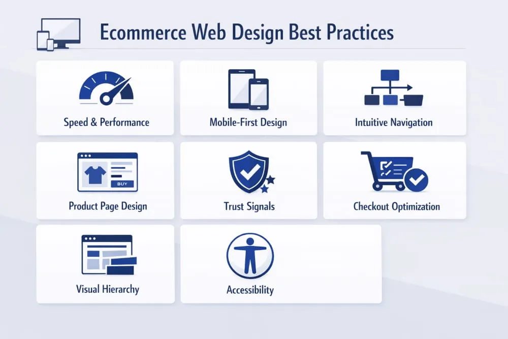
The 12 E-commerce Web Design Best Practices You Cannot Ignore
Knowing what makes a great e-commerce website and actually building one are two very different things. The principles covered in the previous section set the foundation, but principles without execution are just ideas. What follows are the twelve ecommerce web design best practices that translate strategy into a store that genuinely performs. These are not optional refinements. They are the non-negotiables that the best ecommerce web designs consistently get right.
1. Prioritize Speed, The Silent Conversion Killer
Speed is the single most underestimated design element in e-commerce. It does not matter how visually stunning your store is if it takes four seconds to load. By that point, a significant portion of your visitors has already left and is not coming back.
Every additional second of load time compounds the damage. Bounce rates climb. Conversion rates drop. Ad spend goes to waste. And because Google factors page experience into its rankings, a slow site hurts your visibility before a single visitor even arrives.
Prioritizing speed means making deliberate design decisions from the start: compressing images without sacrificing quality, minimizing third-party scripts, choosing a performant ecommerce platform, and regularly auditing your store’s Core Web Vitals. Speed is not a developer’s job alone; it is a design responsibility that shapes every element you choose to include or leave out.
2. Mobile-First Design: Best Practices for Mobile Web E-commerce
Mobile web ecommerce design best practices begin with one fundamental mindset shift: stop treating mobile as a version of your desktop site and start treating it as the primary experience. More than half of all ecommerce traffic now comes from mobile devices, and in many industries that number is significantly higher.
A mobile-first approach means designing for the smallest screen first and scaling up, not the other way around. Buttons must be large enough to tap without frustration. Text must be readable without zooming. Product images must load fast and display cleanly on smaller screens. And the path from product discovery to checkout must be as frictionless on a phone as it is on a laptop.
The best mobile ecommerce experiences are not just responsive, they are intentionally reimagined for the way people actually use their phones: one thumb, in motion, with limited patience for anything that slows them down.
3. Intuitive Navigation and Category Architecture
Your navigation system is the backbone of your e-commerce web design. If visitors cannot find what they are looking for within a few clicks, they will not keep searching; they will leave and find it elsewhere.
Intuitive navigation starts with understanding how your customers think, not how your internal team organizes products. Categories should reflect the shopper’s language and logic. A mega-menu crammed with every subcategory might feel thorough from the inside, but it overwhelms visitors and paralyzes decision-making.
The best ecommerce sites keep top-level navigation simple, use clear and descriptive labels, and make it easy to move between sections without losing context. Breadcrumbs, sticky headers, and well-structured category pages all contribute to a browsing experience that feels effortless, which is exactly what it should.
4. Product Page Design That Drives Purchase Decisions
If there is one page in your e-commerce store that deserves the most design attention, it is the product page. This is where the buying decision is made. Everything else on your site leads here, and if this page does not convert, nothing else matters.
Great product page design answers every question a hesitant buyer might have before they even have to ask. High-quality images from multiple angles, a clear and benefit-focused product description, visible pricing, size guides where relevant, and prominent calls to action all work together to reduce doubt and increase confidence.
The arrangement of these elements matters just as much as the elements themselves. Price and the “Add to Cart” button should be immediately visible without scrolling. Social proof, reviews, ratings, and user-generated photos should appear close to the decision point. Cross-sells and related products should feel like helpful suggestions, not pushy upsells. Every design choice on a product page should serve the conversion, not distract from it.
5. Trust Signals: Reviews, Badges, and Social Proof Placement
Online shoppers are naturally cautious. They are handing money to a website, often for a product they cannot physically examine, from a brand they may never have heard of. Trust is not automatically given; it is earned through design.
Trust signals are the visual and written cues that tell a visitor your store is legitimate, reliable, and worth buying from. These include customer reviews and star ratings, secure checkout badges, money-back guarantee icons, recognized payment logos, and press mentions. Individually, each signal adds a small layer of reassurance. Together, they create an environment where purchasing feels safe.
Placement is critical. Trust signals work best when they appear at the exact moment a visitor’s hesitation peaks, near the price on a product page, at the top of the checkout, and in the footer, where first-time visitors often look to validate legitimacy. Design them to be visible but not intrusive, and ensure they are up to date and accurate. An outdated security badge is worse than no badge at all.
6. Checkout Flow Optimization, Reducing Abandonment by Design
Cart abandonment is one of the most painful realities in e-commerce, and the majority of it is caused not by a lack of buying intent, but by a poorly designed checkout experience. Shoppers who reach the cart want to buy. Your job is to make sure nothing stops them.
The best ecommerce checkout flows share a few common traits: they are short, transparent, and never surprise the customer. Unexpected shipping costs, forced account creation, confusing form layouts, and a lack of payment options are all design failures that send buyers away at the final step.
Streamlining checkout means reducing the number of steps to the absolute minimum, offering guest checkout, and displaying progress indicators. Hence, shoppers know where they are in the process, and error messages are made clear and easy to correct. Every additional field you remove, every unnecessary step you eliminate, and every moment of confusion you prevent is a direct improvement to your conversion rate.
7. Search and Filter UX for Large Catalogs
For e-commerce stores with large or varied product catalogues, search and filtering functionality is not a secondary feature; it is a primary navigation tool. A visitor who uses your site search is one of the highest-intent users on your entire site. If that experience fails them, you have lost a buyer who was ready to convert.
Effective e-commerce search goes beyond basic keyword matching. It should handle misspellings, offer autocomplete suggestions, and surface relevant results even when the query is imprecise. Filtering systems should allow shoppers to narrow results by the attributes that matter most to them, size, color, price range, material, and rating, without requiring them to reload the page each time.
The design of your search and filter interface should feel fast and responsive. Filters should update results dynamically. Selected filters should be clearly visible and easy to remove. And zero-results pages should never be a dead end; they should redirect, suggest alternatives, and keep the shopper engaged rather than defeated.
8. Visual Hierarchy and Whitespace Done Right
Visual hierarchy is the invisible architecture of your e-commerce web design. It determines what a visitor sees first, what they notice second, and what guides their eye toward the action you want them to take. When it is done well, visitors move through your pages naturally and intuitively. When it is done poorly, they feel confused or overwhelmed, even if they cannot explain why.
Whitespace, the space between elements, is one of the most powerful tools in a designer’s kit, and one of the most frequently misused in e-commerce. Many store owners equate space with wasted space. In reality, whitespace gives your content room to breathe, makes your key messages easier to absorb, and helps your calls to action stand out.
The best ecommerce web page designs use size, contrast, color, and spacing to create a clear visual path from conversion entry. Headlines are bold and immediate. Product images command attention. Prices and CTAs are visually prominent. Supporting information, descriptions, reviews, and guarantees support the decision without competing for attention.
9. Color Psychology and Brand Consistency in E-commerce
Color is not decoration; it is communication. Every color choice in your e-commerce web design sends a signal to the visitor, whether you intend it to or not. Blues communicate trust and reliability. Greens suggest health, sustainability, or financial confidence. Reds create urgency. Neutrals project premium quality and minimalism. These associations are not universal rules, but they are real psychological tendencies that smart e-commerce designers account for.
More important than individual color choices is consistency. Your brand colors, typography, and visual style should remain coherent from the homepage to the product page to the checkout, and across every device. Inconsistency in design creates subconscious doubt. When something looks slightly off, visitors sense it even when they cannot name it, and that unease erodes the trust you have worked to build.
Brand consistency is also a long-term investment. The more coherently your store looks and feels across every touchpoint, the more recognizable and trustworthy your brand becomes over time.
10. Accessibility and Inclusive Design Standards
An accessible e-commerce website is not just an ethical choice; it is a business advantage. Designing for accessibility means ensuring that your store can be used by people with visual impairments, motor disabilities, cognitive differences, and other needs that standard design often overlooks. When you design inclusively, you significantly expand your potential customer base.
Practical accessibility in e-commerce web design includes sufficient color contrast between text and backgrounds, alt text on all product images, keyboard-navigable menus and checkout flows, clearly labeled form fields, and readable font sizes that do not require zooming. None of these requires sacrificing visual quality; they require intentionality.
Beyond the moral and commercial case, accessibility increasingly carries legal weight in many markets. Building it into your design from the start is far simpler and less costly than retrofitting it later, and it signals to every visitor that your brand values all of its customers equally.
11. Homepage Design That Converts First-Time Visitors
Your homepage is your digital storefront window. For first-time visitors, who often arrive with curiosity but no specific intent, it has one job: make them want to go deeper. A homepage that fails to communicate who you are, what you sell, and why you are worth their time within the first few seconds will not get a second chance.
The most effective ecommerce homepage designs lead with a clear and compelling value proposition, supported by strong visual imagery that immediately establishes the brand’s identity and product category. Navigation is prominent and logical. Featured collections or bestsellers give visitors an immediate on-ramp into the catalog. Trust signals, press mentions, customer counts, and guarantee badges appear early and naturally.
What the best ecommerce homepages avoid is equally instructive. They do not overwhelm with too many competing messages. They do not bury the most important information below the fold. They do not make the visitor work to understand what the store sells. Simplicity, clarity, and visual confidence are the hallmarks of a homepage that converts.
12. Post-Purchase Experience and Design Continuity
Most e-commerce design thinking stops at the checkout confirmation page. That is a missed opportunity. The post-purchase experience, order confirmation emails, tracking pages, packaging, and return portals are direct extensions of your e-commerce web design and shape whether a first-time buyer becomes a loyal customer.
A well-designed order confirmation page reassures the buyer immediately. It confirms what was purchased, sets clear expectations for delivery, and ideally introduces the next step, whether that is a referral offer, a loyalty program, or a warm, brand-consistent thank-you message.
Design continuity through the post-purchase journey means applying the same visual standards, tone, and care to every customer touchpoint after the sale. Brands that do this well do not just make sales; they build relationships. And in e-commerce, the lifetime value of a returning customer is always worth more than the margin on a single transaction.
15 of the Best Ecommerce Web Design Examples (And What Makes Them Work)
Reading about e-commerce web design best practices is one thing. Seeing them executed at the highest level is another. The best ecommerce web designs do not just follow principles; they make those principles invisible, wrapping them inside experiences that feel intuitive, beautiful, and effortless to navigate.
The examples below span industries, price points, and audiences. What they share is a commitment to design that serves the customer first and the brand second, and the results speak for themselves. As you read through each one, pay attention not just to how they look, but to the specific decisions that make them work.
Direct-to-Consumer Brands Doing It Right
The direct-to-consumer model lives and dies by e-commerce web design. Without a retail presence to fall back on, the website is the entire brand experience, and the best DTC brands treat it accordingly.
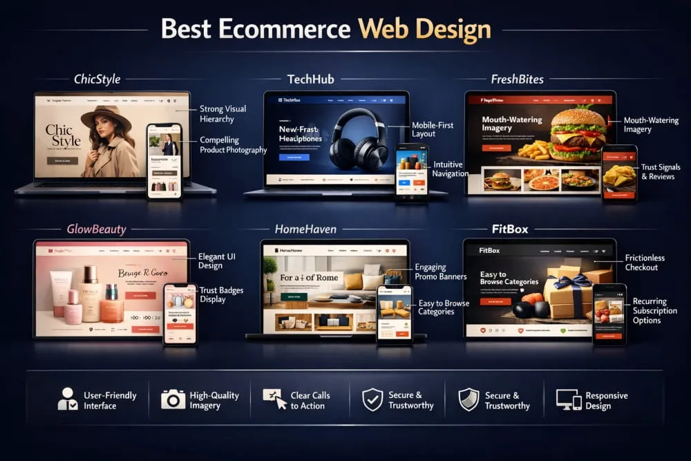
Allbirds is a masterclass in using simplicity as a conversion tool. The site strips away everything that does not serve the purchase decision: clean, white space; confident product photography; and a navigation structure so clear that finding, evaluating, and buying a product takes minutes rather than moments of confusion. Their sustainability messaging is woven naturally into the design rather than bolted on as an afterthought, which makes it feel genuine rather than performative.
Glossier built one of the most recognized e-commerce aesthetics in the beauty industry, with soft pinks, editorial photography, and a layout that feels more like a lifestyle magazine than a product catalog. But beneath the visual identity is smart ecommerce design: prominent customer reviews, frictionless product discovery, and a mobile experience that feels native rather than adapted. The design earns trust through consistency and earns conversions through clarity.
Warby Parker demonstrates how to handle complexity, a large product catalog with significant customization options, without overwhelming the visitor. Their virtual try-on feature is seamlessly integrated into the product page rather than hidden as a secondary option, which turns a potential purchase barrier into a genuine selling point. The overall web ecommerce design feels premium without being exclusionary.
What these brands share is the understanding that DTC ecommerce design must do the work a salesperson would in a physical store: building rapport, answering questions, and guiding the customer toward a confident decision.
Best E-commerce Web Page Design for Fashion & Apparel
Fashion ecommerce is one of the most competitive and design-sensitive categories in the industry. Shoppers expect visual richness, but they also demand speed and ease. The best fashion ecommerce web designs strike that balance precisely.
SSENSE operates at the intersection of luxury fashion and editorial content, and its e-commerce design reflects that positioning perfectly. Product pages are spacious and image-led, with photography that communicates the lifestyle context of each piece. Navigation is minimal and elegant. The checkout experience is clean and trusted. What SSENSE gets right is that the design never competes with the product; it frames it.
Gymshark built a global activewear brand largely on the strength of its ecommerce experience. Their site is fast, visually energetic, and deeply community-focused. User-generated content and athlete photography are woven throughout the design, creating a feel that is authentic rather than staged. Their product pages handle a large number of variants, colours, sizes, and fits without ever feeling cluttered, which is a significant design achievement in the apparel category.
Everlane uses transparency as both a brand value and a design principle. Pricing breakdowns, factory information, and material sourcing are presented clearly and attractively on product pages, turning information that most brands hide into a trust-building feature. The design is restrained and editorial, which suits a brand built on the idea that quality speaks for itself.
The lesson across these fashion ecommerce sites is consistent: great apparel web design makes the product the hero while removing every possible obstacle between the visitor and the purchase.
Best Web Design E-commerce Sites for Electronics & Tech
E-commerce for electronics presents a unique design challenge. Products are complex, specifications matter enormously, and the purchase decision often involves significant research before commitment. The best e-commerce web designs in this category make that research process feel easy rather than exhausting.
Apple sets the global benchmark for premium electronics ecommerce. Every page is a study in restraint, vast white space, cinematic product imagery, and copy that translates technical specifications into human benefits. The configuration and purchase flow for complex products like MacBooks or iPhones is genuinely impressive: it guides the customer through meaningful choices without ever feeling like a form to be filled out. The design communicates that Apple understands exactly who their customer is and respects their intelligence.
Sonos applies a similar philosophy to the home audio category. Their e-commerce site leads with immersive lifestyle imagery that sells the experience of great sound before a single specification is mentioned. Product pages introduce technical detail progressively, enough to inform without overwhelming, and the ecosystem visualization that shows how multiple products work together is a design feature that directly addresses a key purchase consideration and removes it as a barrier.
Samsung faces the opposite challenge: an enormous catalogue across multiple product categories, all of which need to coexist on a single ecommerce platform without confusion. Their solution is a filtering and navigation architecture that allows visitors to move fluidly between categories and product lines, supported by comparison tools that make side-by-side evaluation effortless. For a catalog of that scale, the e-commerce website design feels remarkably manageable.
Best E-commerce Website Design for Food & Subscription Boxes
Food and subscription ecommerce requires design that does something particularly difficult: it must make intangible or perishable products feel desirable, trustworthy, and worth committing to, often before the customer has ever tasted or experienced them.
Graza is one of the most talked-about food ecommerce designs in recent years, and for good reason. Their olive oil brand uses bold color, playful typography, and irreverent copy to create a product page experience that feels entirely unlike the rest of the category. The design earns attention, holds it, and converts it, with genuine personality at every step. It proves that even commodity-adjacent products can command premium positioning through design excellence.
Athletic Greens (AG1) sells a health supplement through a subscription model, which means the design must overcome two significant barriers: scepticism about health product claims and the commitment required for recurring purchases. Their ecommerce design addresses both through an unusually high volume of well-organized trust signals, clinical research references, third-party testing badges, and thousands of reviews, presented in a layout that feels clean and credible rather than overwhelming.
Imperfect Foods built its e-commerce experience around a mission-driven brand identity, and the design reinforces that at every level. The weekly box customization interface, essentially the core product, is designed to be genuinely enjoyable to use: clear, visual, and satisfying to interact with. When the core action of your ecommerce experience feels like a feature rather than a chore, you have achieved something most subscription businesses never manage.
Lessons You Can Steal From Each Example
Studying the best e-commerce web designs is only valuable if it changes how you build or commission your own store. Across all the examples above, a set of repeatable lessons emerges.
The most important thing is this: every great e-commerce site is built around a deep understanding of its specific customers’ hesitations. Allbirds removes the complexity of choice. Glossier makes product discovery feel social and personal. Apple translates complexity into clarity. Graza makes a low-interest category impossible to ignore. Each design decision is a direct response to a specific barrier to the purchase.
The second lesson is that restraint is a skill. The best e-commerce web page designs resist the urge to say everything at once. They sequence information in the order a customer actually needs it, revealing detail progressively rather than dumping it all on the page and hoping something sticks.
The third lesson is that consistency compounds. None of these brands achieved the quality of their e-commerce design in a single launch. They iterated, tested, and refined, maintaining a coherent visual and structural identity while improving conversion at every stage of the funnel.
You do not need Apple’s budget or Gymshark’s brand recognition to apply these lessons. You need clarity about who your customer is, honesty about where your current design fails them, and the discipline to fix one thing at a time until your store earns the trust it deserves.
Choosing the Best E-commerce Platform for Web Designers
Platform choice is one of the most consequential decisions in e-commerce web design, and one of the most frequently made on the wrong criteria. Too many store owners choose a platform based on price or name recognition alone, without considering how deeply that choice will shape what is designable, what is buildable, and what is possible as the business grows.
For web designers, the stakes are even higher. The platform is not just the foundation; it is the canvas. Choose the wrong one, and you spend the majority of your time fighting limitations rather than crafting experiences. Choose the right one, and the platform disappears into the background, letting the design do what it is supposed to.
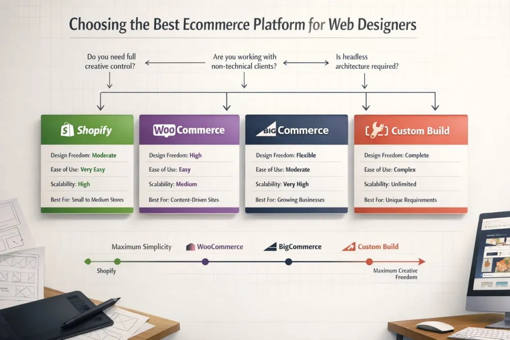
Platform Comparison: Shopify vs WooCommerce vs BigCommerce vs Custom Builds
Each major e-commerce platform makes a different set of promises, and each delivers on them in its own way.
Shopify is the dominant force in e-commerce for good reason. It is fast to launch, reliably hosted, and supported by an enormous ecosystem of themes and apps. For most small to mid-sized ecommerce businesses, it delivers everything needed to build a high-performing online store without requiring deep technical expertise. Its theme architecture, particularly with the introduction of Online Store 2.0, gives designers meaningful control over layout and customization through a visual editor, while still allowing custom code for more ambitious builds.
Where Shopify has limits is in deep structural customization. The platform makes certain design and checkout decisions that cannot be overridden without a Shopify Plus subscription, which is significantly more expensive. For businesses with straightforward needs, this is rarely a problem. For designers pushing the boundaries of what an e-commerce experience can be, it occasionally is.
WooCommerce sits at the opposite end of the control spectrum. As a plugin built on WordPress, it gives designers and developers virtually unlimited freedom to build, modify, and extend. There is no checkout you cannot customize, no layout you cannot override, no feature you cannot build with the right development resources. For designers who are comfortable with WordPress and want maximum creative and functional control, WooCommerce remains one of the most powerful options available.
The trade-off is complexity. WooCommerce requires more active management, hosting, security, performance optimisation, and plugin compatibility, all of which fall to the store owner or their developer. For clients who want to manage their own store without technical support, this can quickly become a burden.
BigCommerce occupies a thoughtful middle ground. It offers more built-in functionality than Shopify at comparable price tiers, meaning fewer apps needed to achieve advanced features, and fewer restrictions on checkout customization than Shopify’s standard plans. It is particularly well-suited to mid-market and enterprise ecommerce businesses that need scalability without a fully custom build. For web designers working with growing brands, it deserves serious consideration that it rarely receives.
Custom builds, whether headless ecommerce architectures using platforms like Shopify as a backend with a custom frontend, or fully bespoke solutions, offer the highest level of design freedom and investment. When a brand’s ecommerce experience needs to do something that no off-the-shelf platform can accommodate, a custom build is the answer. For everyone else, it is an expensive solution to a problem that does not yet exist.
Which Platform Gives Designers the Most Creative Freedom?
Creative freedom in e-commerce platform design is not just about what you can build; it is about how much of your time and energy you spend building the experience versus working around platform constraints.
By that measure, a headless Shopify or a well-configured WooCommerce installation offers the most genuine creative freedom for designers willing to invest the technical effort. Both allow the frontend to be built with modern frameworks such as React, Next.js, and similar tools, unlocking performance and design capabilities that template-based builders simply cannot match.
For designers who want strong creative control without deep development investment, Shopify’s theme system, particularly when combined with custom Liquid code, offers a practical and powerful balance. The majority of the best e-commerce web designs built on Shopify do not look like Shopify at all, which is a testament to how far the platform’s customization has evolved.
Best E-commerce Platform for Web Designers Working With Clients
When the question shifts from personal preference to client work, the calculus changes. The best e-commerce platform for web designers working with clients is not necessarily the one with the most design freedom; it is the one that creates the best long-term outcome for the client relationship.
Shopify wins this consideration for most client scenarios. Its admin interface is genuinely intuitive for non-technical store owners, its support infrastructure is robust, and its reliability means designers spend less time on maintenance calls and more time on new projects. Handing a Shopify store to a client feels like handing them something they can actually run, which is ultimately what a good client project delivers.
WooCommerce makes sense for clients who are already operating in the WordPress ecosystem, have existing technical support, or require a level of customization that Shopify cannot provide at a reasonable cost. BigCommerce is worth recommending to clients who are scaling quickly and need enterprise-grade features without enterprise-grade pricing.
The honest answer is that the best e-commerce platform for web designers is the one that best matches the specific client’s needs, technical comfort level, and growth trajectory, not the one the designer is most familiar with.
When to Go Headless, and When Not To
Headless ecommerce, decoupling the frontend presentation layer from the backend commerce engine, has moved from a niche architectural choice to a mainstream conversation in ecommerce web design. And for good reason: when done well, headless builds deliver exceptional performance, complete design freedom, and seamless omnichannel experiences.
But headless is not the right answer for every project, and recommending it without qualification does clients a disservice. A headless build requires significantly more upfront development investment, a more technically capable team to maintain, and a longer time to launch. For a growing e-commerce brand with straightforward needs and limited development resources, those costs rarely justify the benefits at the early stage.
Headless makes genuine sense when performance at scale is a primary concern, when the brand needs to deliver consistent commerce experiences across multiple surfaces, web, app, in-store kiosks, voice, or when the design vision is simply incompatible with what any themed platform can deliver. In those scenarios, the investment pays for itself in performance gains and design quality that would otherwise be impossible.
For everyone else, a well-built store on a capable platform will outperform a poorly executed headless build every time. Architecture serves design. It does not replace it.
Best AI Web Design Tools for E-commerce in 2026
Artificial intelligence has moved from a peripheral conversation in e-commerce web design to a central one. In 2026, the question is no longer whether AI belongs in the e-commerce design workflow; it clearly does, but where it adds genuine value and where it still falls short of what human design judgment delivers.
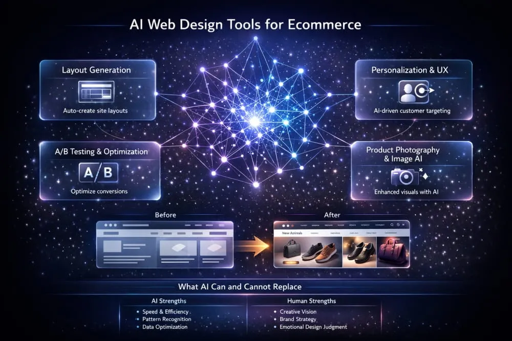
How AI Is Reshaping E-Commerce Web Design Workflows
The most immediate impact of AI on e-commerce web design is speed. Tasks that previously required hours of manual work, generating layout variations, writing product descriptions, resizing and optimising images, and creating A/B test hypotheses can now be completed in minutes with the right tools. This does not make designers redundant. It makes the designers who use these tools effectively significantly more productive than those who do not.
AI is also changing how e-commerce sites personalize the shopping experience. Rather than showing every visitor the same homepage or the same product recommendations, AI-driven personalization engines can adapt the layout, content, and product sequencing in real time based on browsing behavior, purchase history, and predicted intent. The result is an e-commerce experience that feels tailored rather than generic, thereby improving engagement and conversion.
Top AI Tools for Layout Generation, Personalization, and A/B Testing
Several AI tools have earned their place in the e-commerce web design workflow in 2026.
Framer AI and Relume have become genuinely useful for generating initial layout structures and wireframes at speed, particularly useful for designers who need to rapidly prototype concepts for client review without investing hours in manual wireframing. The output requires refinement and creative direction, but the starting point is significantly better than a blank canvas.
For personalization and on-site optimization, Dynamic Yield and Bloomreach lead the category. Both platforms use machine learning to adapt ecommerce experiences at an individual visitor level, from product recommendations to content sequencing to promotional targeting, with a level of sophistication that rule-based systems cannot match.
VWO and Convert have integrated AI-assisted hypothesis generation into their A/B testing platforms, helping ecommerce teams identify where design changes are most likely to improve conversion and what those changes should be, informed by behavioral data rather than guesswork.
AI-Powered Product Photography and Image Optimization Tools
Product photography has historically been one of the most expensive and time-consuming elements of e-commerce web design. AI is changing that rapidly. Tools like Photoroom and Claid.ai allow ecommerce brands to remove backgrounds, generate lifestyle contexts, and produce studio-quality product images at a fraction of the traditional cost and turnaround time.
For image optimisation, ensuring that product photography loads quickly without visible quality loss across devices, tools like Cloudinary and Imgix use AI to automatically serve the right image format, size, and compression level based on the visitor’s device and connection speed. This is one of the clearest examples of AI simultaneously improving both design quality and e-commerce performance.
What AI Cannot Replace in E-commerce UX Design?
For all its capabilities, AI has genuine limitations in e-commerce web design that are worth understanding, especially as enthusiasm for the technology occasionally outpaces its practical usefulness.
AI tools excel at pattern recognition and optimization within defined parameters. They are exceptional at analyzing what has worked before and generating variations on it. What they cannot do reliably is make the kind of creative leaps that define the best ecommerce web designs, the decision to break category conventions entirely, the instinct for what a brand needs to say that it has never said before, or the human judgment required to understand why a customer feels hesitant in a way that no data set yet captures.
The e-commerce designers who will build the best web experiences in 2026 and beyond are not those who resist AI tools; they are those who use them with clarity about what those tools are actually good for. AI accelerates execution. It does not replace vision. And in e-commerce web design, vision remains the variable that separates the stores that dominate their categories from those that merely compete in them.
E-commerce Web Design for Special Use Cases
Most e-commerce web design guidance is written with a single model in mind: a brand sells a physical product, a customer buys it, and the transaction is complete. But a growing number of online businesses operate outside that model entirely, and the design principles that serve a standard retail store often need significant rethinking when the business model itself is different.
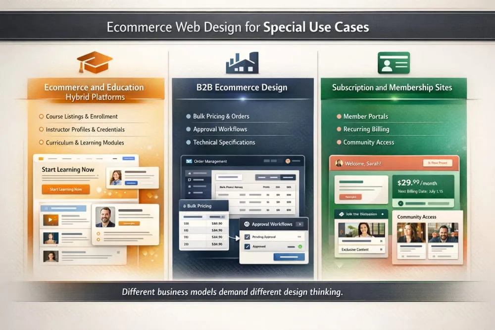
Hybrid platforms, B2B ecommerce, and subscription or membership businesses each present unique design challenges that standard best practices only partially address. Understanding those differences is what separates a generic e-commerce build from one that is genuinely engineered for how a specific business actually works.
Best Web Design for E-commerce and Education (Hybrid Platforms)
The intersection of e-commerce and education is one of the fastest-growing segments in the digital economy. Online course platforms, coaching businesses, professional certification programs, and learning communities all need to sell access to knowledge, and selling knowledge requires a fundamentally different design approach than selling a physical product.
The core challenge in e-commerce and education web design is that the product is invisible before purchase. A customer buying a pair of shoes can see exactly what they are getting. A student investing in an online course is buying an outcome they cannot yet experience, a skill, a transformation, a qualification. The design must bridge that gap through trust, credibility, and a clear articulation of what life looks like after the purchase.
This means that the best web design for e-commerce, hybrid, and education platforms relies heavily on proof. Instructor credentials, student testimonials, curriculum previews, completion rates, and career outcome data are not supplementary details; they are the primary conversion drivers and deserve prominent placement throughout the page architecture. A well-designed course sales page functions less like a product page and more like a persuasive long-form argument, building the case progressively until the decision to enroll feels obvious rather than risky.
Navigation in hybrid platforms also requires careful thought. A visitor exploring the educational content side of the business has different needs than one who has already decided to purchase and is navigating the member portal or course library. The best hybrid ecommerce and education designs maintain a clear separation between the marketing-facing storefront and the student-facing learning environment, while making the transition between the two feel seamless and rewarding.
Platforms like Teachable, Kajabi, and Thinkific have built their entire product propositions around solving this design challenge. But brands that treat these platforms as finished solutions rather than starting points consistently underperform those that invest in customizing the experience to reflect their specific audience, content, and positioning.
Designing for B2B Ecommerce, Different Rules, Different Priorities
B2B ecommerce has historically lagged consumer ecommerce in design quality, and that gap represents a significant opportunity for brands willing to invest in the experience. The assumption that B2B buyers are less influenced by design than consumer shoppers is not just outdated, it is commercially damaging. B2B buyers are consumers outside of work hours. They bring the same expectations for usability, clarity, and professional polish to their business purchasing decisions that they bring to everything else they buy online.
That said, B2B ecommerce web design operates by a genuinely different set of priorities. The purchase cycle is longer, the decision often involves multiple stakeholders, order volumes are larger, and pricing is frequently negotiated rather than fixed. These realities shape the design from the ground up.
Trust and credibility carry even more weight in B2B than in consumer ecommerce. When a procurement manager evaluates vendors, the professionalism of a vendor’s website is a direct proxy for the professionalism of the company behind it. A poorly designed B2B ecommerce site communicates organizational immaturity and sends buyers toward competitors whose digital presence better reflects the kind of partner they want to do business with.
Account management functionality is central to B2B ecommerce design in a way that it rarely is for consumer stores. Buyers need to access order history, reorder frequently purchased items, manage multiple shipping addresses, view custom pricing tiers, and share carts or approval workflows with colleagues. All of this needs to be designed with the same care and clarity that consumer ecommerce applies to its checkout flow, because for a B2B buyer, these features are the checkout flow.
The product catalog itself often requires a different design approach in B2B contexts. Detailed technical specifications, compatibility information, bulk pricing tables, and downloadable data sheets must be accessible without cluttering the primary browsing experience. Progressive disclosure, surfacing the most important information first and revealing technical depth on demand, is a particularly effective design pattern for B2B product pages.
Subscription and Membership Site Design Considerations
Subscription ecommerce introduces a design challenge that one-time purchase stores never face: convincing a visitor to commit to an ongoing relationship rather than a single transaction. That is a fundamentally higher bar, and the design must rise to meet it.
The first design priority for subscription ecommerce is making the value of the subscription immediately and viscerally clear. Visitors need to understand not just what they receive, but why they will want to keep receiving it month after month. This means leading with the ongoing benefit, the transformation, the convenience, the community, the savings, rather than the mechanics of the subscription itself. Too many subscription ecommerce sites bury their most compelling proposition beneath pricing tables and feature lists.
Pricing transparency is non-negotiable in subscription design. Hidden fees, unclear billing cycles, and difficult cancellation processes are the fastest way to generate chargebacks, negative reviews, and social media criticism. The best subscription ecommerce designs present pricing with complete clarity: what you pay, when you pay, what you get, and how you cancel if you choose to—counter-intuitively, making cancellation easy and visible increases conversions, because it removes the commitment anxiety that prevents many visitors from subscribing in the first place.
For membership sites that combine community access with content or products, the design must serve two distinct audiences simultaneously: prospective members who need to be convinced to join, and existing members who need an environment that delivers on the promise that convinced them to join. The public-facing marketing design and the member-facing portal design require separate and equal levels of design investment, a truth that many membership businesses discover only after their churn rate tells them that the experience inside the membership does not match what the design outside it promised.
The most successful subscription and membership ecommerce designs treat the post-signup experience as the beginning, not the end, of the design challenge. Onboarding flows, progress indicators, community features, and content discovery interfaces all contribute to the member’s sense that they made the right decision, and that sense of validation is what turns a first billing cycle into a long-term relationship.
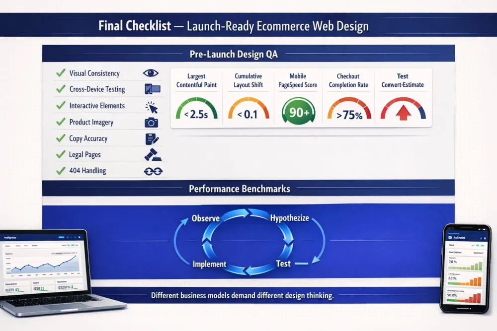
Final Checklist, Launch-Ready Ecommerce Web Design
Getting to launch is an achievement. Getting to a launch that actually performs is something else entirely. The difference between the two is almost always found in the details, the things that get rushed in the final days of a build, deprioritized under deadline pressure, or simply overlooked because everyone involved has been staring at the same screens for too long to see them clearly.
This final section is designed to be your last line of defense before your ecommerce store goes live, and your ongoing framework to ensure it keeps improving after it does.
Pre-Launch Design QA Checklist
A thorough pre-launch design review is not about perfection. It is about eliminating the category of problems that erode trust and cost conversions from day one. Work through each of these areas before a single visitor arrives.
Visual consistency across every page.
Open your homepage, category pages, product pages, cart, and checkout in sequence. Do they feel like they belong to the same brand? Typography, button styles, spacing, and color usage should be completely coherent from start to finish. Inconsistency at any point in the funnel creates subconscious doubt that damages conversion.
Cross-device and cross-browser testing.
Your ecommerce web design needs to perform on Chrome, Safari, Firefox, and Edge, on desktop, tablet, and mobile. Pay particular attention to iOS Safari, which renders certain CSS properties differently and represents a significant share of mobile ecommerce traffic. Do not assume that because something looks right on your development machine, it looks right everywhere.
All interactive elements function correctly.
Every button, dropdown, filter, size selector, quantity input, and form field needs to be tested in context, not just in isolation. Add products to the cart from every entry point. Complete the checkout process end-to-end using both guest checkout and account-based checkout. Test every payment method you offer. Test discount code application. Test error states what happens when a card is declined, a field is left empty, or a product goes out of stock mid-session.
Product imagery is optimized and consistent.
Every product image should be compressed for the web without visible quality loss, displayed at consistent dimensions, and accompanied by accurate and descriptive alt text. Inconsistent image sizes across a category page are among the most common and damaging visual design failures in e-commerce; they make even a well-designed store look unprofessional.
All copy has been proofread.
Spelling errors and grammatical mistakes on an e-commerce site are trust signals in the wrong direction. Review every headline, product description, policy page, error message, and email template before launch. Pay particular attention to the checkout flow, where copy clarity directly affects conversion.
404 pages and redirects are handled.
Any URLs from a previous site version need to redirect correctly. Your 404 page should be designed, not abandoned, with navigation options that keep visitors in the store rather than returning them to their browser.
Legal pages are complete and accessible.
Privacy policy, terms of service, returns and refund policy, and shipping information pages must be live, accurate, and easy to find from every page of the site. These are not bureaucratic formalities; they are a trust infrastructure that a significant proportion of first-time visitors will check before completing a purchase.
Performance Benchmarks Every E-commerce Site Should Hit
Design quality and technical performance are inseparable in e-commerce. A beautifully designed store that fails to meet basic performance benchmarks will underperform a simpler store that loads fast and functions reliably. Before launch, measure your store against these standards.
Core Web Vitals.
Google’s Core Web Vitals are the most important performance benchmarks for e-commerce in 2026. Largest Contentful Paint, the time it takes for the main content of a page to load, should be under 2.5 seconds. Cumulative Layout Shift, the visual stability of a page as it loads, should score below 0.1. Interaction to Next Paint, the responsiveness of the page to user input, should be under 200 milliseconds. These are not arbitrary targets. They reflect the thresholds at which real users begin to experience frustration, and Google uses them as ranking signals.
Mobile page speed.
Run your store through Google PageSpeed Insights and aim for a mobile score of 70 or above before launch, with a target of 85 or above within the first quarter of operation. Mobile e-commerce performance is disproportionately important because mobile traffic is large and mobile users are impatient.
Time to First Byte.
TTFB measures how quickly your server responds to a request. It should be under 600 milliseconds. A slow TTFB is almost always a hosting or server configuration issue, and it affects every subsequent performance metric on every page of your store.
Checkout completion rate.
While not a technical benchmark in the traditional sense, your checkout completion rate, the percentage of visitors who begin checkout and complete a purchase, is the most direct measure of whether your e-commerce web design is doing its job. Industry averages hover around 45-60% of initiated checkouts. If yours falls significantly below that range from the earliest data, the checkout design warrants immediate review.
Ongoing Design Maintenance and CRO Iteration Framework
Launch is not the finish line. For the best ecommerce web designs, launch is the moment when the real work begins, because real traffic generates real data, and real data reveals what no amount of pre-launch testing can: how actual customers behave when they encounter your store without anyone guiding them.
Conversion rate optimization is not a one-time project. It is a continuous discipline built on a simple loop: observe, hypothesize, test, and implement. The stores that consistently improve their performance over time are the ones that treat this loop as a permanent part of how they operate, not as an initiative that runs for a quarter and then stops.
Establish your baseline metrics immediately.
From day one, track conversion rate by device, bounce rate by landing page, cart abandonment rate, and checkout drop-off by step. These baselines are your reference point for everything that follows. Without them, you cannot know whether a design change improved performance or simply coincided with a traffic shift.
Let behavioral data guide your priorities.
Heatmaps, scroll maps, and session recordings, available through tools like Hotjar or Microsoft Clarity, reveal where visitors actually look, how far they scroll, and where they abandon. This behavioral data is consistently more revealing than analytics alone, because it shows the why behind the numbers. A high bounce rate on a product page tells you something is wrong. A heatmap showing that visitors repeatedly click on a non-clickable element tells you exactly what to fix.
Test one variable at a time.
The temptation in CRO is to change multiple elements simultaneously, particularly when performance is disappointing. Resist it. When you test one variable at a time, a headline, a button color, the placement of a trust badge, or the length of a product description, you know precisely what drove any change in conversion. When you change five things at once and conversion improves, you have learned very little about why.
Schedule quarterly design reviews.
Beyond ongoing CRO testing, commit to a structured design review every quarter. Evaluate your store against the best e-commerce web designs in your category. Assess whether your design still accurately reflects your brand positioning. Review customer feedback for recurring friction points. Identify pages or flows that have not been updated since launch and evaluate whether they still represent best practice.
The e-commerce stores that dominate their categories are not the ones that launched with the best design. They are the ones who treated their launch as the beginning of a design process that never truly ends, always measuring, always learning, always closing the gap between what their store currently delivers and what their customers deserve.
That is the standard worth building toward. And with the foundation this guide has laid, you now have everything you need to build toward it.
Frequently Asked Questions (FAQ’s)
What are the most important elements of e-commerce web design?
The most important elements are site speed, intuitive navigation, mobile responsiveness, trust signals, and a frictionless checkout experience. These are the non-negotiables that directly determine whether a visitor stays, browses, and buys, or leaves without a second thought.
How much does e-commerce web design cost?
E-commerce web design costs vary widely depending on complexity, platform, and whether you hire a freelancer, agency, or use a template. A professionally customized Shopify store might range from $3,000 to $20,000, while a fully custom build can run significantly higher.
What makes an e-commerce website design “the best”?
The best e-commerce web design is not the most beautiful; it is the most effective. It converts visitors into buyers consistently, builds trust instantly, and makes the path from discovery to purchase feel completely effortless.
How does mobile design affect e-commerce conversion rates?
Poor mobile design is one of the leading causes of lost e-commerce revenue. With the majority of traffic arriving on mobile devices, a slow, cluttered, or difficult-to-navigate mobile experience directly translates into abandoned carts and missed conversions.
What do the best e-commerce websites have in common?
They deeply understand their customer, remove every unnecessary obstacle between browsing and buying, and maintain complete consistency in design, trust, and brand identity across every page and device.


