
A one product Shopify store is one of the most focused, conversion-driven ecommerce models you can build today. Instead of spreading attention across dozens of products, you center your entire brand, messaging, and marketing around a single offer, and optimize everything to sell it better than anyone else.
When executed properly, a single product Shopify store eliminates distraction, simplifies your funnel, and creates a clear path from traffic to checkout. Every headline, image, testimonial, and ad works toward one goal: selling one product exceptionally well. That clarity is exactly why many fast-scaling brands start as a Shopify store with one product before expanding later.
But here’s the truth: most guides don’t explain that simply having one product doesn’t guarantee conversions. A profitable one product store requires strategic positioning, a high-converting layout, the right theme structure, and aligned marketing, especially if you’re driving paid traffic from platforms like TikTok.
This ultimate guide will walk you through everything, step by step:
- What a one product Shopify store really is (and who it’s best for)
- How to build it correctly from day one
- What themes and templates actually work
- The exact design structure that improves conversion rates
- How to market and scale it effectively
- Real-world patterns from successful single-product stores
By the end, you won’t just understand the concept, you’ll know how to build a streamlined, conversion-focused one product Shopify store that’s structured to grow without internal competition, clutter, or confusion.
What Is a One Product Shopify Store?
A one product Shopify store is a Shopify website built to sell a single core item as its main offer. Instead of listing a catalog of unrelated products, the store is structured around a single-product page experience, a single storyline, a single set of benefits, a single audience, and a single clear call to action. In simple terms, if you’ve ever wondered what a one product Shopify store is, it’s a store where everything exists to sell one product exceptionally well, not a little bit of everything.
You’ll also see this described as a one product Shopify store model, or a Shopify store with one product. The idea is the same: the store is designed to focus attention, reduce decision fatigue, and increase conversions by keeping the visitor’s journey clean and intentional. In some cases, people call it a Shopify store with only one product, which is accurate. However, many brands still add small variations, such as bundles, different quantities, or complementary upsells, without changing their single-product focus.
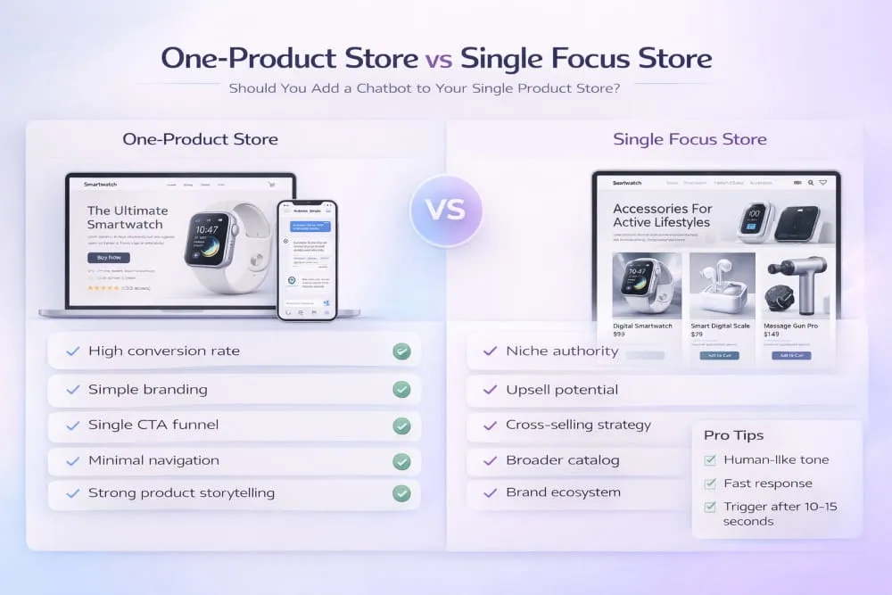
One-Product Store vs Single Focus Store (Clarifying the Model)
A true one-product store is built around one core product as the hero offer, but a single focus can mean something slightly broader. A main product Shopify store may lead with one hero product, supported by a small set of add-ons or variants that make the main offer easier to buy (for example, a bundle pack, a premium version, or a related accessory). The difference is simple:
- One-product store: one core product is the entire business message and store structure.
- Single focus store: one hero product drives most of the revenue, with supporting options that strengthen the offer.
Both can still operate as a single product in practice, because the buyer experience is focused on a single outcome: purchasing the hero product.
Who This Model Is Best For
A one product Shopify store is best for sellers who want speed, clarity, and a clean path to conversion. It works especially well when your product has a clear before-and-after, solves a specific problem, or offers a strong emotional payoff. Because you’re not managing multiple product pages and category collections, you can spend more time perfecting what matters: your messaging, your product presentation, and your traffic strategy.
This model is also ideal if you want to test a single product quickly. With a one-product approach, it’s easier to spot what’s working and what’s not, because everything happens inside one funnel. You’re not guessing which product is underperforming; you’re improving one offer until it becomes profitable.
Common Misconceptions (Why Most Fail)
The biggest misconception is that a one-product store is easy money because it looks simple. In reality, many Shopify stores that sell only one product fail for predictable reasons: weak positioning, generic copy, low trust, and a product page that looks like every other dropshipping store online. If your store doesn’t build credibility fast, customers hesitate, and one-product stores don’t have other products to save the sale.
Another common mistake is treating one product as a limitation rather than a strategy. The goal isn’t just to sell one item; it’s to create a compelling offer that’s impossible to ignore. That means your store must feel like a real brand, not a template. When the product, page structure, proof, and promise are aligned, a one product Shopify store becomes one of the most powerful setups for high-converting ecommerce.
Why One-Product Stores Work (Benefits + Psychology)
A one-product store works because it removes confusion. Most e-commerce stores lose sales not because the product is bad, but because the customer is forced to think too much, too many choices, too many paths, too many reasons to hesitate. A one-product store flips that. It gives the visitor one clear story, one clear solution, and one clear action to take.
From a psychological standpoint, this model is built on focus. When the page, the brand, and the offer all point in the same direction, customers feel guided instead of overwhelmed. That reduction in friction is what turns just browsing into buying.
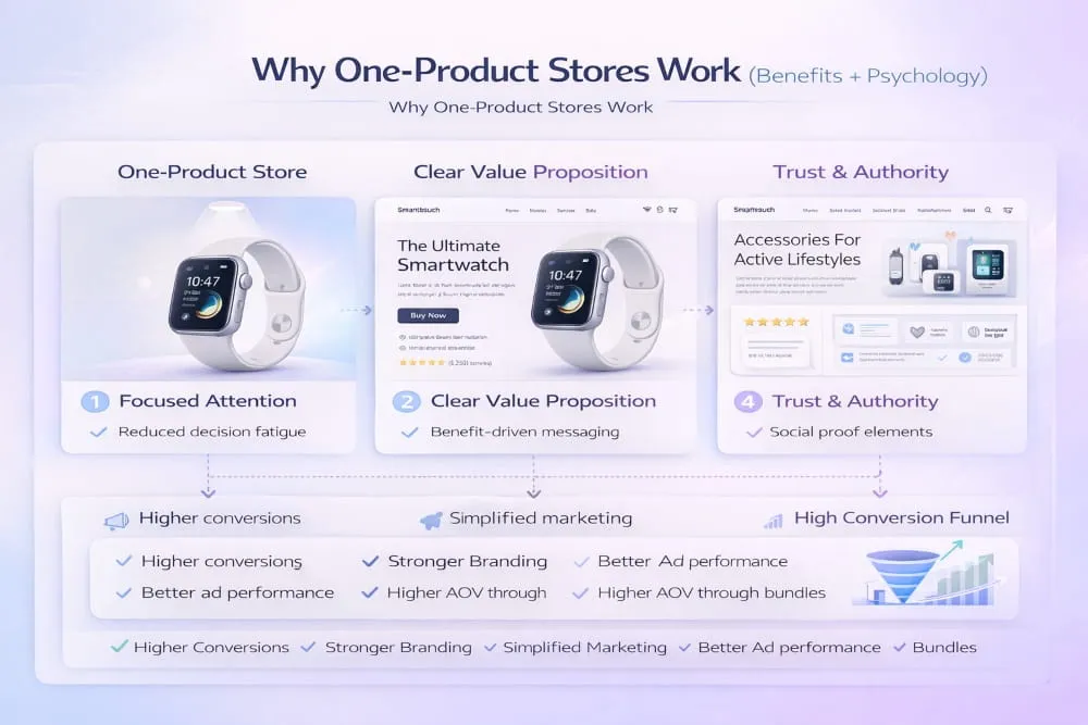
Focused Messaging = Higher Conversion Rate
With multiple products, your messaging is always divided. You end up writing copy that’s broad, safe, and generic because it has to cover too much. A one-product store doesn’t have that problem. Every headline, every benefit, every testimonial, and every visual reinforces the same promise. That repetition isn’t boring, it’s persuasive. It builds certainty.
The result is usually a cleaner value proposition and stronger relevance. And relevance is what drives conversion. When visitors immediately feel, This is exactly for me, they move faster toward checkout.
Simplified Branding and Faster Decision-Making
One product stores are easier to brand because you’re not trying to create a store identity for multiple unrelated items. You’re building a brand around one result. That’s why single-product brands often feel more premium: the design, tone, and messaging are consistent because they’re built around one purpose.
This also speeds up decision-making. Customers don’t have to compare ten products, bounce between collections, or wonder which option is best. They either want the solution or they don’t. When they do, the buying path is short, and short paths convert.
Better Ad-to-Landing-Page Match
One of the biggest advantages of a one-product store is how well it aligns with paid traffic, especially short-form platforms like TikTok. Ads work best when they promise one specific outcome. If your ad focuses on one pain point and one solution, the landing page should continue that exact story without switching topics.
With a one-product store, that match is easy. The ad talks about one problem; the page expands on it; proof supports it; and the offer closes it. That continuity builds trust quickly, lowering bounce rates and increasing conversion rates because customers feel they landed in the right place.
Easier Optimization (One Funnel, One Offer)
Optimization becomes much simpler when there’s only one funnel to improve. Instead of juggling dozens of product pages, you can focus on where it delivers the highest return. You test one headline, one set of images, one pricing structure, one offer bundle, and one checkout flow. Every improvement compounds because it affects the entire business.
This is why one-product stores can scale aggressively once they find product-market fit. When the offer is right, you’re not managing complexity; you’re improving a single system until it becomes a predictable machine.
One Product Shopify Store vs Multi-Product Store
Choosing between a one product Shopify store and a multi-product store isn’t about which model is better. It’s about which model fits your product, your marketing style, and how quickly you want to reach a profitable, repeatable funnel. A one-product store wins on focus and speed. A multi-product store wins on variety and long-term catalog growth. The key is understanding what each setup is designed to do, and where it can quietly hurt conversions.
A Shopify store with one product is built for one outcome: sell a single offer with maximum clarity. That clarity often improves conversion rate because the visitor isn’t pulled in multiple directions. A multi-product store, on the other hand, gives shoppers more options and can increase average order value through browsing. Still, it also introduces more friction, more decision fatigue, and more pages to optimize.
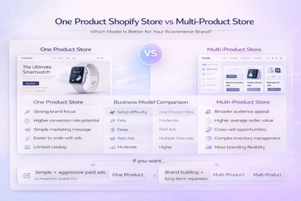
When a One-Product Store Is the Smarter Choice
A one-product store is usually the smarter choice when your product solves a clear problem, and your marketing is built around a strong angle. It’s especially effective if you plan to run paid ads, because you can align one message with one landing experience and one checkout path. You’re not asking customers to explore; you’re guiding them to one decision.
This model also makes sense if you want to launch quickly and improve fast. With one funnel, you can iterate your headline, visuals, offer, and proof without spreading your attention across multiple products. For many sellers, this is the simplest way to find product-market fit and build momentum before expanding.
When You Should NOT Do One-Product
A one-product store is not the best choice if your product requires extensive education across multiple use cases, or if your audience expects variety before buying. If the product naturally belongs in a category where shoppers compare options, like different styles, specs, or alternatives, a single-product structure can feel limiting. Customers may want to browse, compare, and shop around, and a strict one-product setup might reduce trust if it feels too narrow.
You also shouldn’t force one product if your growth depends on cross-selling a range of items. Some businesses are designed around collections, bundles, and product ecosystems. In that case, a multi-product store may convert better because customers expect a broader offering and feel safer buying from a brand that looks established.
How to Expand Later Without Losing Focus
One of the smartest ways to use a one-product store is to treat it as a focused launch model rather than a permanent restriction. You can expand without losing clarity by keeping one hero product as the main message while introducing supporting options that strengthen the original offer.
A clean expansion strategy looks like this: keep one primary product as the front door, maintain the same core positioning, and add only what supports the same buyer intent, like bundles, quantities, upgrades, or tightly related add-ons. That way, the store still feels like a one-product Shopify store, not a scattered catalog. You keep the conversion advantages of focus, while slowly building the foundation for a multi-product brand when the time is right.
Step-by-Step: How to Create a One-Product Shopify Store
If you want to learn how to create a one product Shopify store, the biggest mistake is rushing into design before you’ve locked the product, offer, and structure. A successful one-product store isn’t just a Shopify site with one item. It’s a focused funnel where every element supports one conversion goal. The steps below show exactly how to create a product Shopify store the right way, so you don’t launch something that looks good but doesn’t sell.
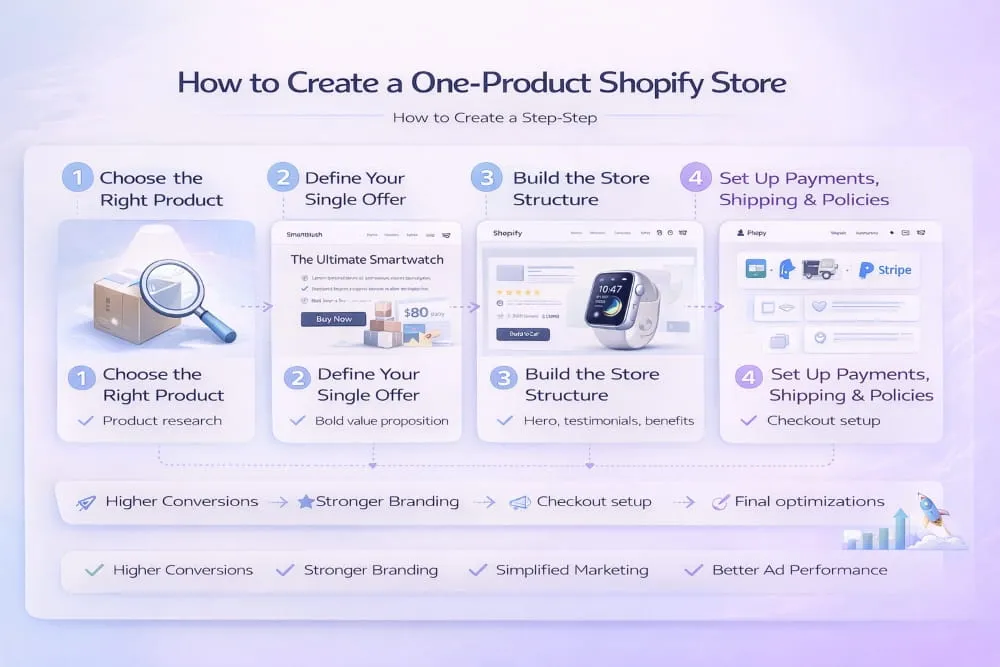
Step 1: Choose the Right Product (Criteria Checklist)
The product you choose matters more in a one-product setup because you don’t have other items to compensate for weak demand or low margins. The best one-product winners usually share a few traits: they solve a specific problem, feel easy to understand, and can be demonstrated quickly through visuals or short-form content.
Your product is a strong fit if it checks most of these boxes:
- It delivers a clear outcome (before/after is obvious).
- The benefit can be explained in one sentence.
- It has room for healthy margins after shipping and fees.
- It’s easy to show in a video or real-life use case.
- It has a reason to buy now (scarcity, seasonal need, urgency, or a strong angle).
If your product requires long explanations or the customer must compare multiple options to choose the right one, it may be harder to scale as a single-product funnel.
Step 2: Define Your Single Offer (Bundle, Guarantee, Pricing)
A one-product store succeeds when the offer feels complete. That doesn’t always mean the product itself is unique; it means your presentation and deal structure make it compelling. Before you start setting up a one product Shopify store, define exactly what the customer is getting, why it’s worth the price, and what reduces their buying risk.
Focus on three key levers:
- Pricing strategy: Make the price feel proportional to the value and the outcome. Avoid pricing that triggers the ‘looks cheap’ suspicion.
- Bundling: Offer quantity breaks or bundles that increase average order value without changing the single-product focus.
- Guarantee: A clear, confident guarantee removes hesitation and increases conversions, especially for cold traffic.
When your offer is tight, you don’t need tricks. You need clarity, proof, and a frictionless checkout path.
Step 3: Build the Store Structure (What Pages You Actually Need)
When people ask how to build a one product Shopify store, they often think they need a complex site. You don’t. You need a clean structure that builds trust and answers objections fast. The goal is to keep everything focused, while still looking like a legitimate brand.
A conversion-ready one-product store structure usually includes:
- Home page (optional but useful): A streamlined version of your product story with a strong CTA.
- Product page (the main sales page): Where the full persuasion happens, including benefits, proof, FAQs, guarantee, and the offer.
- About page: Short, credible brand story (even if you’re small).
- Contact page: Simple contact method + support expectations.
- Policy pages: Shipping, returns/refunds, privacy, terms. These reduce friction and build legitimacy.
This setup is exactly how to build a one product store on Shopify without bloating the site or distracting visitors with unnecessary navigation.
Step 4: Set Up Payments, Shipping, and Policies
This is the trust infrastructure of your store. If payments or shipping feel unclear, you’ll lose buyers even if your product is strong. When setting up a Shopify store for one product, prioritize simplicity and transparency.
Key execution points:
- Enable fast checkout options (Shop Pay, Apple Pay/Google Pay, where available).
- Make shipping costs and delivery timelines easy to find.
- Write policies in plain language, and avoid vague promises.
- Add order confirmation and support expectations to reduce chargebacks.
This is the part most sellers treat as boring, but it’s often the difference between a store that converts and a store that leaks sales.
Step 5: Launch Readiness Checklist
Before you hit publish and create a Shopify store for real traffic, do a final check for speed, clarity, and conversion flow. The launch stage isn’t about perfection; it’s about removing obvious friction so your testing data is reliable.
At minimum, confirm:
- Mobile experience is clean (most traffic will be mobile).
- Checkout works end-to-end (test a real order).
- The product page includes proof (reviews/UGC), a guarantee, and clear FAQs.
- The main CTA is visible early and repeated naturally.
- Shipping/returns are easy to find and don’t feel risky.
- Page speed is acceptable (slow pages kill paid traffic performance).
Once these steps are complete, you’re not just launching a Shopify store with one product. You’re launching a focused system that can be tested, optimized, and scaled with far less complexity than a multi-product catalog.
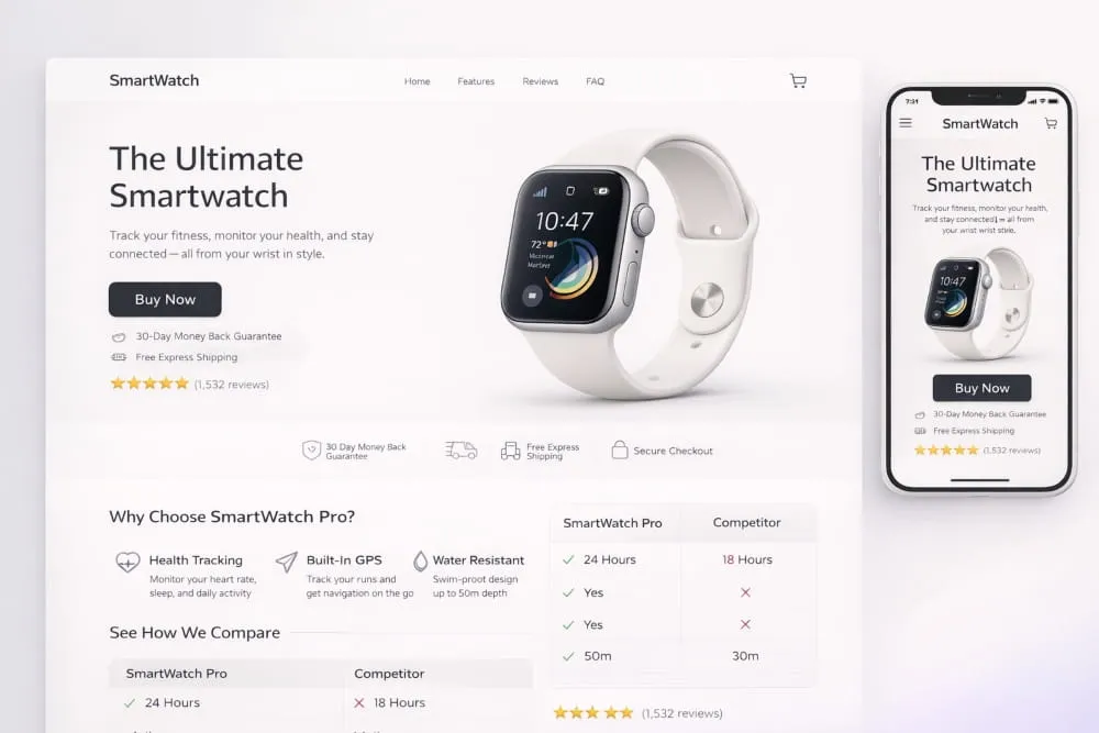
The Best Shopify Themes for a One Product Store
Choosing the right Shopify one product store theme isn’t about picking the prettiest design; it’s about choosing a layout that supports one goal: getting a visitor from interest to checkout with as little friction as possible. A strong one product Shopify store theme should feel fast, focused, and conversion-first. It should quickly highlight your product benefits, build trust naturally, and keep the call to action visible without forcing the shopper to hunt for it.
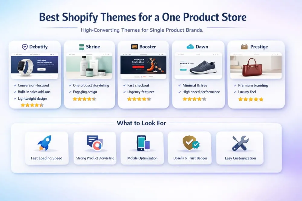
The best part is that you don’t need a complicated theme to win. You need a Shopify theme for a one-product store that loads quickly, offers flexible sections, and makes it easy to structure your product story in a clean, persuasive order. When your theme supports the funnel, the page does the selling, even before you start running ads.
What a One-Product Theme Must Have (Speed, Sections, Sticky ATC, Reviews)
A one-product store lives and dies by the product page experience. Your theme should help you present a single offer like a premium brand, not like a generic template store. At a minimum, the best Shopify theme for a one-product store will include:
- Speed and lightweight code so the page loads quickly on mobile
- Flexible sections (hero, benefits, comparison, proof, FAQs, guarantee) without heavy custom coding
- Sticky add-to-cart (or sticky buy button) to reduce scroll-to-buy friction
- Review-friendly layout that makes social proof feel native, not bolted-on
- Strong mobile experience with clean spacing, readable text, and clear CTAs
If a theme forces you into a cluttered header, too many navigation links, or a distracting browse the store structure, it’s working against your one-product funnel.
Best Free Theme Options for One-Product Layouts
A free Shopify one-product store theme can work extremely well, especially if you’re launching and testing. The real difference isn’t free vs paid. It’s whether the theme lets you build a persuasive page structure without limitations. A solid one-product Shopify store theme free should allow you to:
- Create a clean, distraction-free header
- Add multiple content sections on the product page
- Showcase proof (reviews, UGC, badges) in the right places
- Keep the page visually consistent and mobile-first
If a free theme supports a strong section-based product page, you’re already in a great position. Your copy, visuals, and offer will matter more than the theme price tag.
Best Paid Theme Traits (If Applicable)
Paid themes can be worth it when you need stronger conversion features, more layout flexibility, and a more polished brand feel without hiring a developer. The best theme for a product store on Shopify in the paid category usually brings:
Better built-in sections, smoother animations without slowing speed, stronger product page layouts, and conversion features that reduce drop-off, like enhanced sticky ATC, quick checkout prompts, and a clean, upsell-friendly design.
That said, don’t buy a paid theme hoping it will fix a weak offer or unclear messaging. A premium theme amplifies what’s already good. It doesn’t replace product-market fit.
Theme Setup Tips (Sections to Prioritize)
Whether you’re using a theme or a Shopify one-product store template, your setup should follow a conversion sequence, not a design sequence. In other words: build the page like a sales story, not like a brochure. The most effective one-product layouts usually prioritize sections in this order:
Start with a strong hero who states the outcome and the primary benefit. Immediately follow with proof and credibility. Then expand into benefits, problem-solving clarity, and objections before you close with a guarantee, FAQs, and a final call to action.
When your theme supports this flow, you’re not just picking from Shopify themes one product store options, you’re building a page structure that’s designed to convert cold traffic consistently.
One Product Store Design That Converts (Layout Blueprint)
A one-product store doesn’t win because it looks fancy. It wins because the design removes hesitation and guides the buyer to a single clear decision. In a one-product Shopify store, design is not decoration; it’s structure. It’s how you control attention, build trust, and keep momentum moving toward checkout.
The best-converting layouts follow a simple rule: the customer should understand what the product does, why it matters, and why it’s safe to buy within the first few seconds. Everything after that should deepen belief, answer objections, and make the purchase feel like the obvious next step.
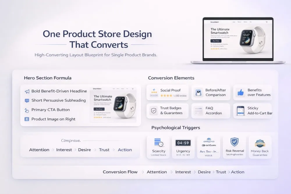
Above-the-Fold Formula (Headline, Proof, CTA)
Above the fold is where most one-product stores either win the sale or lose the visitor. Your first screen must communicate the outcome instantly, not just the product name.
A high-converting above-the-fold section typically includes:
- A clear, benefit-led headline (the outcome, not the features)
- A supporting line that clarifies how it works or who it’s for
- Immediate proof (rating, short testimonials, UGC snapshot, trust badges, kept clean)
- A visible call-to-action that doesn’t require scrolling to find
The goal is to reduce. What is this? And can I trust this? as quickly as possible. If you achieve that, the rest of the page simply reinforces the decision.
Product Page Section Order (The Conversion Stack)
A one-product store is basically a single-page funnel. The most effective product pages follow a predictable persuasion order: clarity first, then belief, then safety, then action. If you place sections randomly, visitors have to work to understand the offer, and they won’t.
Here’s the conversion stack that consistently works for a one-product store:
- Hero (benefit + CTA + proof)
- Problem → Solution explanation (why this matters)
- Key benefits (scannable, outcome-driven)
- How it works (simple, visual, removes confusion)
- Social proof (reviews, UGC, before/after, results)
- Objection handling (shipping, quality, sizing, does it really work?)
- Offer stack (what’s included, bundle options, pricing clarity)
- Guarantee + risk reversal
- FAQs
- Final CTA section (summary + confidence close)
When your sections follow this flow, the page feels like a guided buying experience instead of a long wall of content.
Trust Elements: Reviews, UGC, Guarantees, FAQs
Trust is the currency of single-product selling. Since shoppers can’t browse a catalog to feel the brand, your product page must create credibility through signals that feel real and consistent.
High-impact trust elements include authentic reviews placed in the right spots, UGC that shows the product in real life, a clear guarantee that reduces perceived risk, and FAQs that answer the exact objections that stop purchases. The important part is placement: proof should show up early to build confidence, and it should appear again later to reinforce the decision when buyers are close to checkout.
A one-product store should feel transparent. When customers can quickly find shipping timelines, return expectations, and what they’re actually getting, conversion rates improve because doubt decreases.
Mobile-First Design Rules (TikTok Traffic Ready)
If you’re sending traffic from TikTok (or any short-form platform), assume most visitors will land on mobile and decide in seconds whether to stay. Your layout must be built for thumb-scrolling, not desktop browsing.
Mobile-first design means: readable text sizes, clean spacing, a CTA that stays easy to reach, and sections that load fast without heavy clutter. Avoid tiny buttons, overcrowded icons, and long paragraphs that feel like work. Keep visuals strong and purposeful. If your product page feels smooth, fast, and obvious on a phone, you’re already ahead of most one-product stores competing in the same space.
A converting one-product layout isn’t complicated; it’s intentional. When your headline creates clarity, your structure builds belief, and your trust elements remove risk, a one product Shopify store becomes a focused funnel that turns cold traffic into confident buyers.
How to Market a One Product Shopify Store
Learning how to market a one product Shopify store is less about finding a magic platform and more about building a repeatable message that sells the same offer from multiple angles. A one-product store gives you a major advantage: you’re not juggling different products and audiences. You’re sharpening one story until it performs consistently, then scaling what works.
The goal is simple: attract the right people, keep the product message consistent from ad to page, and follow up until the buyer is ready. When you combine strong creativity with a focused funnel, a one-product store becomes much easier to grow because every improvement compounds into the same offer.
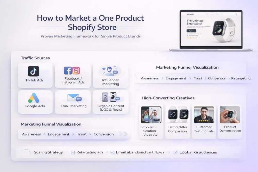
Content Angles That Sell One Product Repeatedly
Most one-product stores fail because they try one ad idea, don’t see instant results, and quit. In reality, your product can be marketed in dozens of ways without changing the product at all, only the angle. Different buyers respond to different motivations: pain relief, convenience, status, savings, speed, or emotional payoff.
Your job is to turn one product into multiple reasons to buy while keeping the core promise consistent. For example, one angle can focus on the problem it solves, another on the before-and-after outcome, another on how simple it is to use, and another on proof that it works. This is how you sell one product repeatedly without sounding repetitive: the message stays familiar, but the entry point changes.
Email/SMS Basics for One-Product Funnels
Email and SMS are where a one-product store quietly becomes profitable. Paid traffic is rarely one-and-done. Most people need time, reassurance, or a second look before they buy. That’s why follow-up matters: it recaptures interested visitors and increases conversion without increasing ad spend.
Keep it simple and structured. Your flow should reinforce the same core message the product page delivers: the problem, the solution, the proof, and the safety. Use short emails that highlight one benefit at a time, include real-world proof, and address objections like shipping, returns, or “does this actually work?” SMS should be even tighter, quick reminders, limited-time nudges, and supportive reassurance, not spammy blasts.
Retargeting Essentials
Retargeting is especially powerful for a one-product Shopify store because every message points back to the same offer and page. That consistency increases trust. The best retargeting doesn’t just repeat Buy now. It solves the reason someone didn’t buy the first time.
If visitors drop early, retarget with clarity: what the product does and who it’s for. If they scrolled but didn’t purchase, retarget with proof: testimonials, UGC, results, comparisons, or a quick demonstration. If they reached the cart but abandoned, retarget with reassurance: shipping timelines, guarantee, and risk reversal. The objective is not to pressure, it’s to remove doubt.
Offer Testing (Bundles, Discounts, Upsells)
In a one-product store, the offer is the growth lever. Small improvements in offer structure often outperform endless creative testing because they raise both conversion rates and average order value. The key is to test offers without breaking the single-product focus.
Start with bundles that feel natural: Buy 2, save more, or a family pack. Use discounts strategically, not as your brand identity, so you don’t train customers to wait for sales. Upsells should complement the same intent: faster shipping protection, extended warranty, or a higher-quantity bundle. The store should still feel like a single product-focused store, just with smarter buying options.
When you market a one-product store correctly, you’re not chasing random tactics. You’re building a system: multiple angles that feed one message, a funnel that converts, and a follow-up that closes the gap between interest and purchase. That’s the real formula for marketing a one-product Shopify store and scaling it with confidence.
TikTok Ads for One-Product Stores (Beginner-to-Launch Plan)
TikTok is one of the fastest platforms for testing and scaling a one-product store because it rewards simple stories, strong emotion, and quick demonstrations. But TikTok ads only work when the ad and the store feel like they’re part of the same conversation. The moment your video promises one outcome, and your landing page delivers something different, or feels generic, conversion drops immediately.
For a one-product Shopify store, TikTok is not about making perfect ads. It’s about building a repeatable system: create multiple angles, match the landing page to the exact promise, test quickly, then scale the winners with confidence.
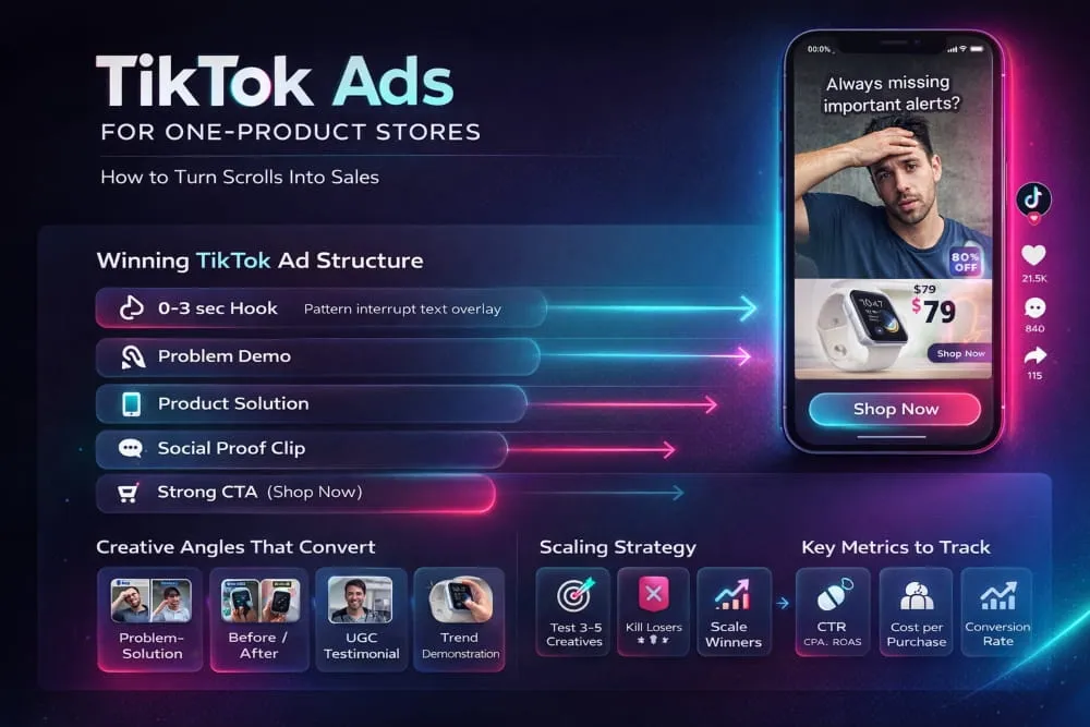
Creative Framework (Hooks, Pain, Proof, Payoff)
Your ad needs to earn attention in the first seconds, then guide the viewer toward belief. The simplest framework for one-product ads is straightforward because it matches how people decide:
Hook → Pain → Proof → Payoff
Start with a hook that feels native to TikTok. It can be a bold claim, a surprising before-and-after, a relatable frustration, or an “I wish I’d known this sooner” moment. Immediately connect that hook to the pain point the product solves. Then show proof, real usage, a visible result, a quick demo, or authentic reactions. Finally, deliver the payoff: the outcome, the benefit, and a clear next step.
The reason this works so well for one-product stores is that it keeps the story focused. TikTok doesn’t reward complexity. It rewards clarity, momentum, and credibility.
Landing Page Alignment (Ad-to-Page Continuity)
The biggest mistake beginners make is treating the TikTok video like the selling and the product page like the store. In a one-product model, the product page continues the same story, not a new one.
If your ad is built around one benefit, the first screen of your product page should repeat that benefit. If your ad uses a specific angle or claim, your headline and visuals should confirm it, not confuse it. If your ad shows a demo, your page should quickly show the same demo again, then expand with proof, reviews, FAQs, and a guarantee.
The more your landing page matches the ad, tone, promise, visuals, and outcome, the less friction the visitor feels. That continuity increases conversion rate because the buyer doesn’t need to re-figure out what they’re looking at.
Testing Structure (What to Test First)
TikTok testing isn’t about testing 10 random things at once. It’s about isolating the variables that matter most: angle, hook, and proof style. Your first goal is to find a message that creates clicks and creates buyers, because high clicks without purchases will burn budget fast.
Start by testing multiple creatives around the same product and offer, keeping the landing page consistent. Change one primary element at a time: the hook, the pain point, the style of proof (demo, UGC, testimonial, before/after), or the payoff. Once you find a winner, you don’t immediately reinvent it; you iterate on it. You create variations that keep the same winning idea but present it in a slightly different way, so performance stays stable over time.
KPI Benchmarks to Track (CTR, CVR, CPA)
TikTok ads can look exciting because views come quickly, but the only numbers that matter are the ones tied to profit. For one-product stores, you want to track performance in a simple funnel sequence:
- CTR (click-through rate): tells you if the creative and hook are working
- CVR (conversion rate): tells you if the landing page and offer are working
- CPA (cost per acquisition): tells you if the overall funnel is sustainable
If CTR is low, your creative isn’t earning attention, or your angle isn’t strong enough. If CTR is good but CVR is weak, your page likely lacks continuity, proof, or clarity. If CTR and CVR look healthy but CPA is still high, your offer structure or pricing may need adjustment, or you may need stronger proof to improve buyer confidence.
TikTok is a speed platform, but scaling a one-product store still comes down to fundamentals: a compelling angle, proof that feels real, and a landing page that continues the same promise without breaking trust. When you combine those pieces, TikTok becomes one of the cleanest ways to launch and grow a one-product Shopify store from beginner to profitable.
One Product Shopify Store Examples (What to Copy Ethically)
When people search for one product Shopify store examples, they’re usually looking for two things: proof that the model works and a blueprint they can apply to their own store. The problem is that most example lists push you toward copying brands directly, layouts, visuals, and even phrasing, which is risky and unnecessary.
The smarter move is to study what the best-performing Shopify stores consistently do well, then recreate the structure and persuasion patterns in your own voice and brand style. That’s how you learn from a successful one product Shopify store without cloning anyone’s identity.
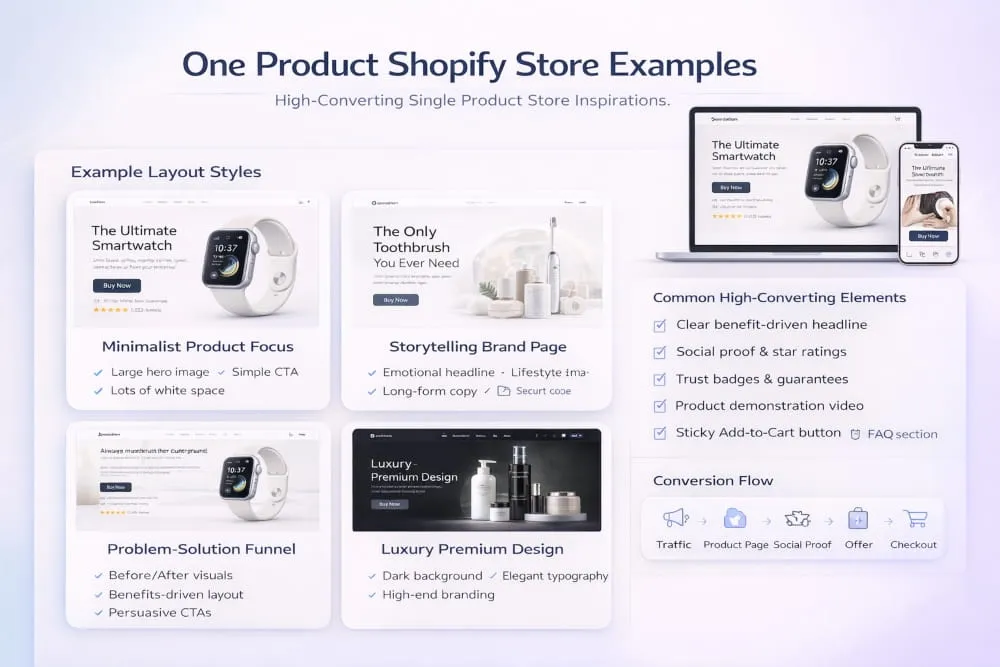
What Good Examples Have in Common
A strong one product Shopify store example almost always feels like a focused sales experience, not a typical e-commerce catalog. The page is designed to quickly guide attention and build trust. You’ll notice that successful stores don’t try to be clever; they try to be clear.
Most top-performing Shopify stores share the same fundamentals:
- A sharp promise above the fold that explains the outcome in seconds
- Proof early (ratings, UGC, results, credibility cues) so trust is built before the pitch gets long
- A page flow that answers questions in the order people naturally think
- A clean offer presentation that makes pricing and bundles easy to understand
- Risk reversal (returns/guarantee) that removes fear at checkout
Even when the product is simple, the experience feels intentional. That’s the difference between a Shopify store with one product and a conversion-focused one-product funnel.
Swipe File: Sections, Copy Patterns, Proof Placement
If you’re collecting examples of one product Shopify stores, build a swipe file around patterns, not screenshots. Your goal is to extract what you can reuse ethically: structure, section order, and the way they reduce buyer hesitation.
Here are the elements worth studying and recreating in your own style:
1) The opening message (above the fold)
Good stores lead with the result. Their headline is benefit-driven, not feature-driven. The copy doesn’t introduce the product; it introduces the transformation.
2) Proof placement
Successful stores don’t hide proof at the bottom. They place it early, then reinforce it later. You’ll often see reviews (or UGC) appear near the top, then again after the benefits, and again near the final call-to-action.
3) Objection handling
They don’t wait for customers to doubt; they preempt doubt. You’ll see short sections addressing quality, shipping time, sizing, does it work, and what’s included, placed before the buyer hits checkout.
4) Offer clarity
The strongest stores make the offer feel simple. Bundles are easy to compare, pricing is transparent, and the buyer always knows what they’re getting.
5) Closing confidence
A strong final section summarizes the promise, reinforces proof, and ends with a guarantee and a clear CTA, without sounding desperate or overly salesy.
When you build your store using these patterns, you’re not copying a brand; you’re copying what makes the page persuasive.
Mistakes You’ll See in Weak Examples
Many stores look like one-product stores but perform poorly because their pages feel templated, untrustworthy, or confusing. You’ll see the same issues repeatedly in weakly successful one-product Shopify store examples lists, because some stores look popular, but their structure is still fragile.
Common mistakes include: a vague headline that doesn’t explain the benefit, no real proof above the fold, a cluttered design that distracts from the CTA, overly long paragraphs that bury the main point, and missing trust builders like policies, shipping clarity, and guarantees. Another big failure point is inconsistency: the ad promises one thing, but the page leads with something else.
The takeaway is simple: don’t chase pretty examples, chase proven patterns. Study what the best one-product Shopify stores do to create clarity, credibility, and momentum, then apply those principles to your own one-product Shopify store in a way that feels original, trustworthy, and built to convert.
AI Chatbot for a One Product Store (When It Helps)
An AI chatbot for Shopify one product store setups can be useful, but only when it supports the same goal your page is already built for: removing hesitation and making the buying decision easier. In a one-product store, customers usually don’t have dozens of questions. They have a few specific doubts that stop them from purchasing, like Will this fit me?, How long is shipping?, What if it doesn’t work? Or is this legit? A well-configured chatbot can handle those questions instantly, especially when you’re getting traffic from TikTok, and most visitors are on mobile.
The key is to treat the chatbot as a support layer, not a replacement for good copy. Your product page should still be the main selling point. The chatbot’s job is to clarify, reassure, and reduce friction when the buyer is close but still uncertain.
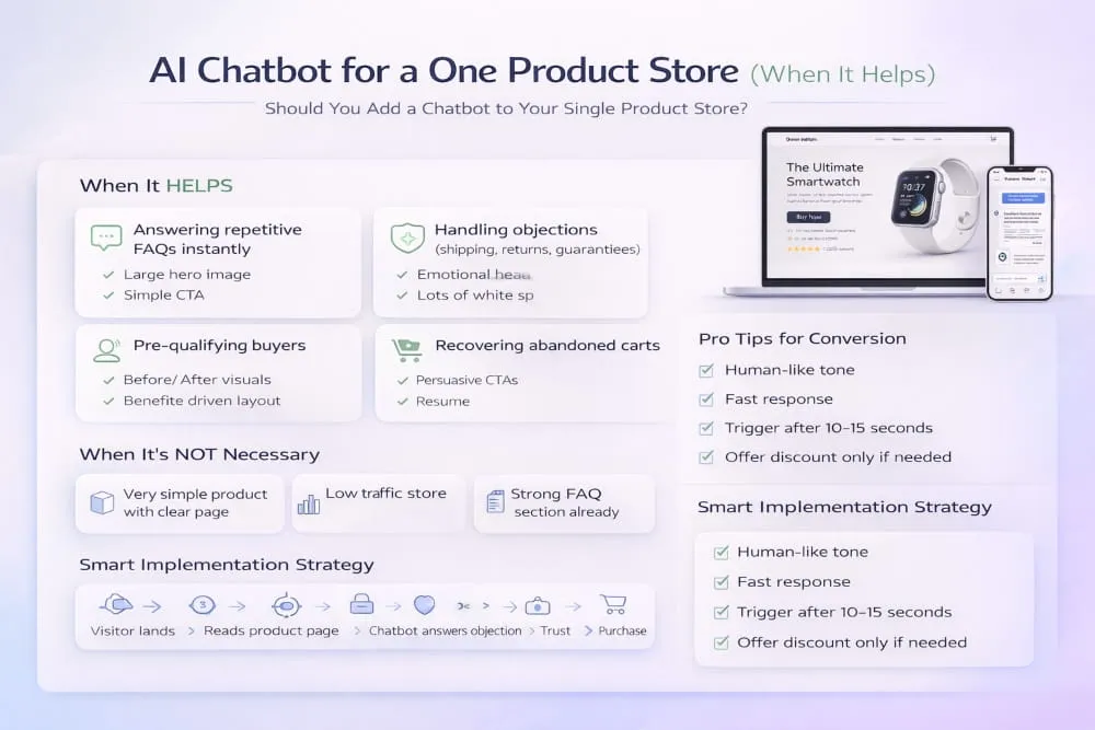
Best Use Cases: Objections, Sizing, Shipping, Returns
A chatbot is most effective when it answers predictable objections in plain language. If your store relies on impulse traffic, quick reassurance can prevent drop-offs. The strongest use cases are:
- Sizing and fit questions (especially if your product has variants or measurement concerns)
- Shipping timelines and delivery expectations (clear and consistent with your policy page)
- Returns and guarantee explanations (risk reversal, simplified)
- Product usage questions (How do I use it?, Is it safe?, What comes in the box?)
When a shopper gets an instant answer without leaving the page, you reduce the chance they bounce or abandon cart.
What NOT to Do With Chatbots
Most one-product stores hurt conversions with chatbots because they make them intrusive or dishonest. Avoid popups that interrupt the first 3 seconds, fake-urgency messages, or overly human scripts that feel manipulative. If the chatbot sounds like a salesperson chasing the visitor around the page, it creates resistance.
Also, avoid letting the bot improvise policies or invent details. Incorrect shipping or return information is one of the fastest ways to create refunds, chargebacks, and negative trust signals. If you use an AI chatbot, its answers must stay aligned with what your store actually offers.
Simple Prompt Ideas for Support + Conversions
A chatbot performs best when you give it tight boundaries and a small set of goals. Keep responses short, helpful, and consistent with the language on your product page. Here are clean prompt directions that typically work well for a one-product store:
- Answer questions about shipping times, returns, and the guarantee using only the policy details on this store.
- When asked if the product works, summarize the main benefits and suggest that the customer review the proof and FAQs on the page.
- If asked ‘Is this legit?’ respond with trust signals: secure checkout, return policy, and customer support options.
- If the customer asks about sizing/fit, ask one quick clarifying question and then provide the recommended option.
Used correctly, an AI chatbot doesn’t replace your funnel; it strengthens it. It gives hesitant buyers a fast, confident answer right when they’re deciding, which can improve conversion rates without changing the focus of your one-product Shopify store.
Final Launch Checklist (Printable-Style Section)
Before you start driving real traffic, you want your one-product store to feel smooth, trustworthy, and ready to convert, especially on mobile. This final checklist is designed to catch the small issues that quietly kill conversions (slow load times, unclear policies, broken checkout flows) and ensure your store is prepared for paid traffic from day one.
Treat this like a pre-flight check. If you can confidently tick these off, you’re not just launching, you’re launching a store that’s built to test cleanly and scale faster.
Store QA Checklist (Speed, Mobile, Checkout)
Start with performance and usability. If the store isn’t fast and mobile-friendly, nothing else matters.
- Your pages load quickly on mobile data, not just Wi-Fi
- The layout is clean on different screen sizes (no broken spacing, overlapping sections, or cut-off text)
- Buttons are easy to tap (especially Add to Cart and Buy Now)
- The product page scroll feels smooth and intentional (no clutter or distracting popups)
- Checkout works end-to-end (you’ve tested a real purchase flow)
- Payment options are enabled and visible (fast checkout where available)
- Shipping costs and delivery timelines are easy to find and consistent across the store
- Return/refund policy is accessible and written in plain language
- Contact method is clear (email or form), and support expectations are realistic
Conversion Checklist (Proof, CTA, Guarantees)
Now check the persuasion layer. This is what turns interest into a purchase.
- Above-the-fold clearly communicates the outcome and who the product is for
- The main CTA is visible early and repeated naturally throughout the page
- Social proof is present and believable (reviews, UGC, testimonials)
- Proof appears early, not only at the bottom of the page
- Key benefits are easy to scan and written as outcomes, not technical fluff
- Objections are handled before checkout (shipping, quality, does it work, sizing if relevant)
- The offer is clear (pricing, what’s included, bundles if used)
- A guarantee/risk reversal is visible and easy to understand
- FAQs answer real buying questions in direct language
Tracking Checklist (Pixels/Events)
If you can’t track performance accurately, you can’t optimize. Set this up before spending money on ads.
- Your tracking pixel is installed correctly
- Core events are firing properly (view content, add to cart, initiate checkout, purchase)
- Events are firing once, not duplicating
- Your checkout success page is tracking purchases accurately
- UTM tracking is consistent, so you know where sales are coming from
- You have a baseline analytics view to monitor traffic, conversion rate, and drop-offs
Post-Launch Optimization Checklist
Once you launch, the goal isn’t to change everything. It’s to improve the highest-impact parts of the funnel using clean data.
- Monitor conversion rate, add-to-cart rate, and checkout completion daily at first
- Collect customer questions and turn them into FAQs and objection-handling sections
- Improve the first screen (headline, proof, CTA) before rewriting the whole page
- Test creative angles and hooks before changing product pricing
- Strengthen proof over time (more UGC, reviews, results)
- Refine your bundles/offer only after you confirm baseline demand
- Fix friction points fast: slow speed, unclear shipping, confusing variants, weak trust signals
If you complete this checklist before launch, your one-product Shopify store isn’t just live, it’s prepared. That’s the difference between guessing and running a real system you can measure, optimize, and scale.
Conclusion
A one-product Shopify store is not a shortcut; it’s a strategy. When done right, it gives you something most e-commerce stores lack: focus. One product, one message, one funnel, and one clear outcome for the customer. That simplicity is what makes it powerful.
Throughout this guide, you’ve seen how a single-product Shopify store works, how to structure it correctly, how to design it for conversions, and how to market it without diluting your message. The real advantage of a one-product store is that every improvement compounds. When you optimize the headline, you improve the whole business. When you refine the offer, you improve the entire funnel. When you strengthen proof, every visitor benefits.
If you execute with clarity, strong positioning, clean layout, aligned ads, real proof, and a confident offer, you don’t need dozens of products to grow. You need one product presented exceptionally well.
Build it focused. Launch it clean. Optimize it deliberately.
That’s how a simple Shopify store with one product turns into a scalable, conversion-driven brand.
Frequently Asked Questions (FAQ’s)
Can a Shopify store have only one product?
Yes, a Shopify store can have only one product. In fact, many brands intentionally build a one-product Shopify store to focus all traffic, messaging, and optimization around a single offer. This approach reduces distraction and often improves conversion rates when executed correctly.
What is a one product Shopify store?
A one-product Shopify store is an e-commerce website built to sell a single core product. Instead of listing multiple items, the entire store structure, design, copy, and marketing are centered around one solution. The goal is to create a focused buying experience that drives higher clarity and stronger conversions.
How do I create a one product Shopify store?
To create a one product Shopify store, you first choose a strong product with a clear benefit and a healthy margin. Then you build a streamlined store structure with a high-converting product page, trust elements, and clear policies. After setup, you test traffic, optimize the offer, and improve the funnel based on real data.
What’s the best Shopify theme for a one product store?
The best Shopify theme for a one-product store is fast, mobile-friendly, and designed for conversion. It should support flexible sections, strong product layouts, visible calls to action, and clean proof placement. The theme matters less than the structure; you want a layout that supports a focused, persuasive product page.
How do I market a one product Shopify store?
You market a one product Shopify store by building multiple content angles around the same core benefit. Platforms like TikTok, Meta, and short-form video work well because they let you test hooks and proofs quickly. Pair paid traffic with email and retargeting so you can follow up with visitors and improve overall conversion rates.
Are one product Shopify stores profitable?
Yes, Shopify store products can be highly profitable when product-market fit is strong, and the funnel is optimized. Because you’re improving one offer rather than many, small increases in conversion rate or average order value can significantly boost revenue. Profitability ultimately depends on product quality, margins, traffic cost, and how well you handle trust and objections.


)