
A great website is rarely judged by its colors or fonts first; it is judged by how effortlessly users can move through it. That seamless experience begins with web page layout design, the strategic arrangement of elements that guides attention, improves readability, and helps visitors complete meaningful actions without confusion.
Whether you are building a homepage, designing a landing page, or structuring a content-heavy site, layout is the invisible framework that determines how professional, trustworthy, and easy to use your website feels. When done correctly, it reduces friction, strengthens visual Hierarchy, and quietly leads users toward the information they need.
Modern web experiences demand more than attractive visuals. Users expect clarity, logical structure, fast scanning, and mobile-friendly organization, all of which depend on thoughtful layout decisions. From grid systems and spacing to section order and responsive behavior, strong layouts balance aesthetics with usability to support both user satisfaction and long-term site performance.
This complete guide is designed to help you understand and apply web page layout design with confidence. You will learn the core principles behind effective layouts, explore proven homepage patterns, discover practical template ideas, and follow step-by-step methods for turning structure into a functional design. The guide also walks through real implementation concepts, including HTML-based layouts and a professional Photoshop workflow for planning visual structure before development begins.
If your goal is to create pages that feel organized, intuitive, and purpose-driven, rather than cluttered or overwhelming, mastering layout is the first step. By the end of this guide, you will have a clear blueprint for planning, designing, and refining web pages that support both usability and long-term growth.
What Is Web Page Layout Design?
Web page layout design refers to the structured arrangement of visual and functional elements on a web page to create a clear, intuitive user experience. It determines how information is organized, how users scan the page, and how effortlessly they can move from one section to another. Rather than focusing only on appearance, layout establishes the underlying framework that supports readability, usability, and engagement.
At its core, layout web page design is about intentional structure. Every section, from the hero area to supporting content, must exist in the right place and follow a logical flow. When executed well, a strong web page design reduces cognitive load, allowing visitors to quickly understand your message without feeling overwhelmed.
The purpose of web page layout design goes beyond aesthetics. It directly influences how users behave: where they look first, what they notice next, and whether they stay or leave. A thoughtful page layout in web design can improve navigation clarity, highlight important actions, and create a sense of professionalism that builds trust instantly.
For example, a carefully planned home page layout in web design typically prioritizes value-driven messaging at the top, followed by supporting proof, structured content sections, and clear calls to action. This predictable yet effective structure helps users orient themselves within seconds, a critical factor in modern browsing behavior.
Ultimately, web page design and layout function as the architectural blueprint of a website. Without a defined layout, even the most visually appealing design can feel chaotic. With one, your content gains direction, Hierarchy, and purpose.
Web Page Design and Layout vs. Just Design (What Layout Actually Controls)
Many people confuse visual design with layout, but the two serve very different roles. Visual design focuses on style, colors, typography, imagery, and branding, while web page design and layout determine how those elements are positioned and experienced.
Think of layout as the structural engineering of a digital space. Before decoration begins, you must decide where content lives, how sections connect, and what path the user should naturally follow. This is why professionals often start with wireframes: to refine the web page design layout before adding stylistic layers.
Layout directly controls:
- Information hierarchy: Which content captures attention first
- Scanning behavior: How easily users can skim headings and sections
- Flow: The order in which ideas unfold across the page
- Spacing: The breathing room that improves comprehension
- Conversion visibility: Where important actions appear
A website can be beautifully styled yet frustrating to use if the layout lacks structure. Conversely, a clean, logical web page layout can make even minimalist visuals feel premium and professional. In practice, strong layout decisions often matter more for usability than decorative choices.
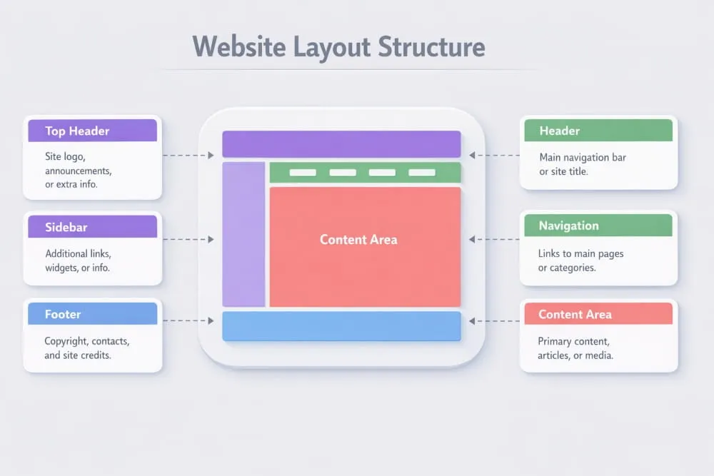
Page Layout in Web Design: Key Building Blocks
Most effective layouts are built using a set of foundational components. While the exact structure varies depending on the page’s goal, these building blocks create consistency and predictability, two qualities users subconsciously appreciate.
1. Header
The header sits at the top of the page and anchors the entire experience. It typically includes branding, primary navigation, and, sometimes, a call to action. A well-structured header supports orientation and reassures visitors they are in the right place.
2. Navigation
Navigation acts as the roadmap of your website. Clear menus reduce friction and help users locate information without guesswork. In modern web design, navigation is often simplified to prioritize clarity over excess options.
3. Main Content Area
This is where your core message lives. Whether presenting services, storytelling, or educational material, the main content should follow a logical structure with clear headings and balanced spacing. Strong layout design for web page environments ensures this area remains visually dominant without feeling crowded.
4. Sidebar (When Needed)
Sidebars provide supporting information such as related resources, filters, or quick links. While not every layout requires one, they can enhance usability when additional context benefits the reader.
5. Footer
Often underestimated, the footer reinforces credibility and provides secondary navigation. It commonly includes contact details, policy links, and additional pathways for deeper exploration.
Together, these elements form the backbone of web page design and layout. When aligned correctly, they create rhythm across the page, helping users anticipate where information will appear next. This predictability builds comfort, and comfort keeps visitors engaged longer.
Understanding these structural foundations is the first step toward designing pages that feel organized, purposeful, and easy to navigate. Once the layout is solid, every other design decision becomes more effective.
Web Page Layout Design Principles That Make Sites Easy to Use
Creating an effective structure is not about randomly placing elements; it requires deliberate planning and adherence to proven usability rules. A well-designed web page layout helps visitors quickly understand your content, navigate without friction, and focus on what matters most. When users don’t have to think about where to click or where to look next, the layout is doing its job.
If you follow a practical web page layout design tutorial, you would notice that the best-performing pages share a few core principles. These guidelines help you design web page layout structures that feel intuitive rather than overwhelming, whether you are working on a homepage or a content-driven page.
Below are the foundational principles professionals rely on when approaching web page layout projects, especially when building a high-performing home page layout that must capture attention within seconds.
Visual Hierarchy (Headings, Spacing, Contrast, Grouping)
Visual Hierarchy determines the order in which users process information. Since most visitors scan rather than read word-for-word, your layout must signal what deserves attention first.
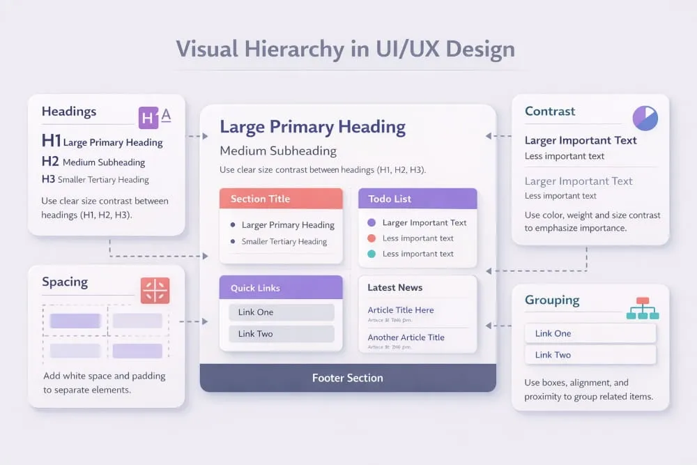
Headings act as anchors that guide the eye across the page. Larger, bolder titles naturally attract attention, while smaller subheadings organize supporting details. Strategic spacing between sections prevents cognitive overload and makes content easier to digest.
Contrast also plays a major role. When important elements, such as calls to action, visually stand out from surrounding content, users recognize their significance immediately. Grouping related information further strengthens comprehension by showing visitors which ideas belong together.
A thoughtful hierarchy transforms a busy interface into a structured experience. Instead of forcing users to search for meaning, the layout quietly leads them through the page in a logical progression.
Grid Systems (12-Column Thinking Without Overcomplication)
Behind most professional layouts is a grid, an invisible structure that keeps content aligned and balanced. While the classic 12-column grid is widely used because of its flexibility, the goal is not mathematical perfection but visual harmony.
Grids help designers maintain proportional spacing, prevent awkward gaps, and create predictable reading paths. They also make it easier to scale layouts across different devices without losing structure.
However, effective grid usage does not mean rigidity. Modern web page layout design tutorials emphasize flexibility within the grid, allowing content to breathe while remaining organized. Think of the grid as a guide rather than a constraint; it supports creativity while preserving order.
When you design web page layout frameworks with a grid in mind, the result feels polished and intentional rather than improvised.
Alignment, Whitespace, and Consistency Rules
Alignment is one of the fastest ways to communicate professionalism. When elements line up cleanly, whether left-aligned, centered, or structured in columns, the page appears trustworthy and easier to scan.
Whitespace, often called negative space, is equally powerful. It gives content room to breathe, allowing users to focus without distraction. Pages that lack whitespace tend to feel crowded and mentally exhausting, even if the information is valuable.
Consistency ties everything together. Repeating patterns for headings, spacing, buttons, and section widths creates familiarity, which reduces the mental effort required to navigate the page. Visitors quickly learn how your layout works, and that comfort encourages them to explore further.
In high-performing web page layout environments, simplicity often wins. Clean spacing and predictable structure outperform cluttered creativity nearly every time.
Mobile-First Layout Decisions (What Changes on Small Screens)
With mobile traffic dominating much of today’s web usage, designing for smaller screens is no longer optional. A mobile-first mindset ensures that your layout prioritizes clarity from the start rather than treating responsiveness as an afterthought.
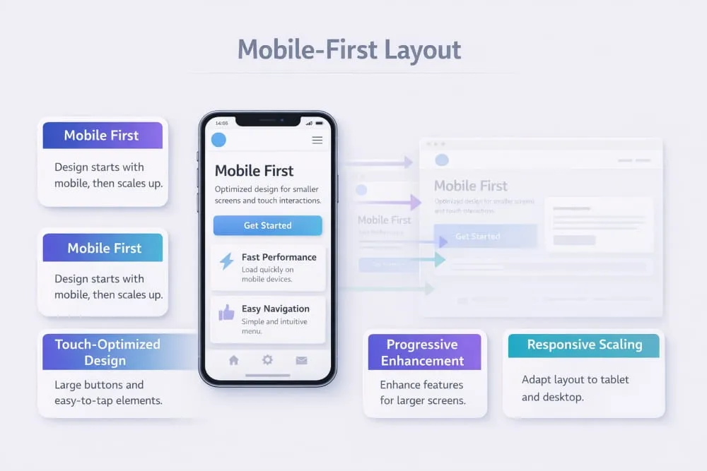
On compact screens, space becomes limited, which forces smarter decisions. Content typically stacks vertically, navigation simplifies, and nonessential elements are reduced or removed. Headlines must remain impactful yet concise, and touch-friendly spacing replaces tightly packed links.
A strong web design home page layout adapts gracefully across devices while preserving Hierarchy and readability. Instead of shrinking a desktop design, mobile-first thinking encourages you to focus on what truly matters, then expand thoughtfully for larger screens.
Ultimately, layouts that perform well on mobile feel cleaner everywhere. By prioritizing usability at the smallest scale, you create a foundation that supports a seamless experience across devices.
Mastering these principles allows you to move beyond guesswork and approach web page layout design with confidence. When Hierarchy is clear, grids provide structure, spacing improves readability, and mobile behavior is considered early, your pages become easier to use and far more effective at guiding visitors toward meaningful action.
Best Web Page Layout Design Patterns (With When-to-Use Guidance)
Choosing the right structure is one of the most important decisions in web page layout design. While creativity has its place, proven layout patterns consistently outperform experimental structures because they align with familiar user behavior. Visitors prefer interfaces that feel predictable, where information appears exactly where they expect it.
If you are exploring web page design layout ideas, studying established patterns is the fastest way to build pages that feel intuitive from the first interaction. These structures also serve as reliable web page design layout templates, giving you a strategic starting point rather than forcing you to design from scratch.
Below are some of the most effective layout models used on modern websites, along with guidance on when each layout template works best.
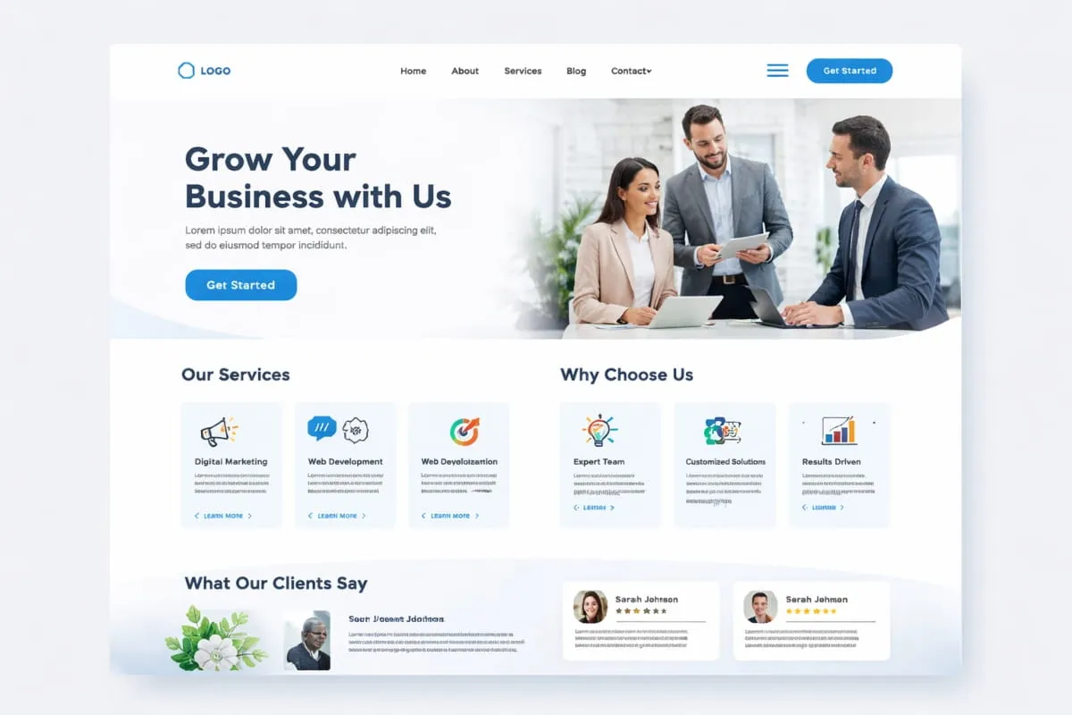
Classic Homepage Layout (Hero + Value Props + Social Proof + CTA)
The classic homepage pattern remains one of the most trusted frameworks because it mirrors how users naturally evaluate a website. It begins with a strong hero section that communicates purpose immediately, followed by supporting elements that reinforce credibility and guide action.
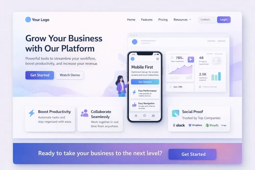
A typical structure includes:
- Hero section: A clear headline paired with supporting text that explains what you offer.
- Value propositions: Short, scannable highlights that quickly communicate benefits.
- Social proof: Testimonials, client logos, or metrics that build trust.
- Primary call to action: A visible next step that removes hesitation.
This layout works especially well for business websites, service providers, and platforms that need to establish clarity within seconds. Among popular web page design layout ideas, this pattern stands out for its balance, informative without overwhelming, structured without feeling rigid.
Use this template when your goal is to create a welcoming first impression while guiding visitors toward a meaningful action.
One-Column vs Two-Column Layouts (Pros and Cons)
Column structure plays a major role in readability and flow. Selecting the right format depends largely on the complexity of your content.
One-column layouts guide users in a single vertical path, reducing distractions and making the experience feel seamless. They are particularly effective for mobile-first designs, storytelling pages, and conversion-focused experiences where maintaining attention is critical.
Advantages:
- Easier scanning
- Strong narrative flow
- Mobile-friendly by default
- Minimal cognitive load
Considerations:
Long pages require thoughtful spacing to prevent fatigue.
Two-column layouts offer greater flexibility by allowing primary content to sit alongside supporting information, such as navigation, highlights, or related resources.
Advantages:
- Efficient use of horizontal space
- Helpful for structured or informational content
- Enables quick cross-referencing
Considerations:
Too many competing elements can dilute focus if not carefully balanced.
When evaluating web page design layout templates, think about user intent first. If clarity and momentum matter most, a single column often performs better. If context enhances understanding, a two-column structure may be the smarter choice.
Landing Page Layout Structure (Focus, Fewer Exits, Clearer CTA)
Landing pages are built with one purpose: conversion. Unlike broader website pages, they remove unnecessary pathways and concentrate attention on a single action.
A high-performing landing layout typically follows this sequence:
- Compelling headline that addresses a specific need
- Supporting explanation that strengthens relevance
- Benefit-driven sections highlighting value
- Trust indicators, such as testimonials or guarantees
- Focused call to action repeated strategically
The defining characteristic of this pattern is restraint. Navigation is often minimized, and visual distractions are reduced so users remain anchored to the primary objective.
Among modern web page design layout ideas, this structure is ideal when promoting a product, capturing leads, or encouraging sign-ups. It ensures that every element supports the same outcome, creating a cohesive and persuasive experience.
Content-Heavy Layouts (Blogs, Docs, Knowledge Bases)
When information depth is the priority, the layout must support readability over visual drama. Content-heavy pages succeed when they make large volumes of material feel approachable rather than intimidating.
Effective structures usually include:
- Clearly defined headings for fast scanning
- Generous whitespace to reduce visual strain
- Sticky navigation or tables of contents for orientation
- Consistent typography for long-form reading
In these environments, structure becomes a usability tool. Readers should be able to jump between sections effortlessly while maintaining a sense of direction.
This web page layout template works best for educational resources, documentation hubs, and long-form articles where clarity directly impacts engagement. Instead of competing for attention, the layout quietly supports the content.
Understanding these patterns helps transform abstract web page design layout ideas into practical frameworks you can apply immediately. Rather than reinventing structure each time, you can rely on tested templates that align with user expectations while still leaving room for brand personality.
When the layout matches the page’s purpose, the entire experience feels natural, and that is often the difference between a visitor who browses briefly and one who stays, explores, and returns.
Web Design Home Page Layout: A Practical Blueprint
A homepage is often the first interaction users have with your brand, which makes its structure one of the most influential elements in web page layout design. Within seconds, visitors decide whether your site feels trustworthy, relevant, and easy to navigate. That judgment is rarely based solely on visuals; it is shaped by how clearly the page communicates its purpose and guides action.
The best web page layout design is not necessarily the most elaborate. Instead, it is the one that removes confusion, prioritizes essential information, and creates a natural path forward. A professional web page design layout balances clarity with persuasion, ensuring users understand what you offer while feeling confident enough to explore further.
Think of your homepage as a strategic blueprint rather than a decorative canvas. Every section should serve a purpose, working together to support comprehension, credibility, and conversion.
Above-the-Fold Checklist (Message, Proof, CTA, Navigation Clarity)
“Above the fold” refers to the portion of the page visible before a user begins scrolling. This area carries significant weight because it forms the visitor’s first impression.
A strong above-the-fold layout should answer three silent questions immediately:
Where am I? What is this? What should I do next?
Key elements to include:
Clear Message
Your headline should communicate value instantly. Avoid clever phrasing that sacrifices clarity; direct language performs better because users do not want to interpret meaning.
Credibility Signals
Subtle proof points such as ratings, recognitions, or client references help reduce hesitation. Even minimal trust indicators can make a layout feel more established.
Primary Call to Action
Every effective homepage guides users toward the next step. Whether it encourages exploration, sign-ups, or inquiries, the action should be visible without competing distractions.
Navigation Simplicity
Menus should feel intuitive at a glance. Overloaded navigation creates friction, while streamlined options reinforce a sense of control.
When these elements align, the result reflects the best web page layout design principles, focused, reassuring, and immediately useful.
Section Order That Converts (Why This Sequence Works)
Beyond the opening view, the sequence of sections plays a critical role in shaping user behavior. Visitors naturally seek understanding before commitment, so the layout should mirror that progression.
A high-performing homepage often follows this structure:
1. Value Introduction: Start with a concise explanation of what you provide and who it is for. Clarity at this stage prevents confusion later.
2. Supporting Benefits: Once users understand your offering, reinforce it with practical advantages. Short, scannable points maintain momentum.
3. Trust Builders: Testimonials, achievements, or recognizable partnerships add reassurance. People are more comfortable engaging when others have done so successfully.
4. Deeper Insight: Provide additional context for those who want to learn more. This might include features, differentiators, or brief overviews.
5. Strong Call to Action: Reintroduce the next step once confidence has been established.
This flow reflects how decisions typically form: awareness, validation, and then action. A professional web page design layout respects that psychological rhythm, making the experience feel effortless rather than forced.
Common Homepage Layout Mistakes (And Fixes)
Even visually appealing pages can struggle if structural decisions create friction. Recognizing common pitfalls helps you refine your approach and maintain the standards associated with the best web page layout design.
Mistake: Unclear positioning
Visitors should never have to guess what your website is about.
Fix: Use a direct headline supported by concise explanatory text.
Mistake: Competing focal points
Too many highlighted elements divide attention.
Fix: Establish a clear visual hierarchy so the most important action stands out.
Mistake: Overcrowded sections
Dense layouts overwhelm users and reduce readability.
Fix: Introduce generous spacing to create visual breathing room.
Mistake: Weak navigation structure
Complex menus slow decision-making.
Fix: Prioritize essential pathways and remove unnecessary options.
Mistake: Inconsistent layout patterns
Irregular spacing or shifting styles disrupts the browsing experience.
Fix: Maintain alignment and repetition to build familiarity.
Avoiding these issues helps transform an average homepage into a polished, professional web page design layout that communicates confidence and reliability.
Web Page Layout Design (Step-by-Step Process)
Designing an effective structure becomes much easier when you follow a clear process. Rather than placing elements based solely on instinct, a structured approach ensures that every decision supports usability, clarity, and purpose. This web page layout design tutorial walks through the essential steps professionals use to transform ideas into organized, high-performing pages.
Whether you are planning a homepage, landing page, or informational resource, the goal is the same: create a layout that guides attention naturally while making content easy to understand. Reviewing a sample web page layout design can be helpful, but understanding the process behind it is what allows you to replicate success consistently.
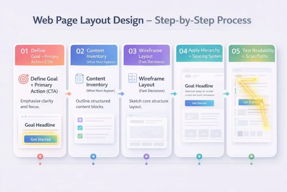
Step 1 , Define Goal + Primary Action (CTA)
Every effective layout begins with a clearly defined objective. Before arranging sections, identify what you want visitors to accomplish, whether that means exploring services, reading content, or taking a specific next step.
Your primary action should influence the entire structure. When the goal is clear, the layout can guide users toward it without friction. For example, if engagement is the priority, the call to action should appear prominently within the natural reading flow rather than being hidden at the bottom of the page.
Without this clarity, layouts often become cluttered because they attempt to support too many competing purposes. Focusing on one dominant action keeps the design intentional and easy to navigate.
Step 2, Content Inventory (What Must Appear)
Once the objective is established, the next step is identifying the content required to support it. Think of this as creating a blueprint of everything the page must communicate.
List essential components such as headlines, supporting explanations, trust indicators, visuals, and navigation elements. Then prioritize them based on importance. High-value information should appear earlier in the layout, while secondary details can follow naturally.
This stage prevents a common mistake: designing first and forcing content to fit later. Instead, the layout evolves around meaningful information, resulting in a more cohesive experience.
Step 3, Wireframe Layout (Fast Decisions)
A wireframe is a simplified structural sketch that focuses purely on placement, not colors, fonts, or stylistic choices. It allows you to quickly evaluate the flow and make adjustments before investing time in visual design.
When creating a wireframe, aim for clarity rather than perfection. Determine where major sections belong, how users will move between them, and whether the sequence feels logical. Reviewing a sample web page layout at this stage can be inspiring, but the emphasis should remain on usability rather than imitation.
Wireframing also encourages faster decision-making. Because the design is intentionally minimal, it becomes easier to experiment with structure until the page feels balanced.
Step 4: Apply Hierarchy + Spacing System.
With the framework in place, refine the layout by introducing Hierarchy and consistent spacing. These elements shape how users interpret the page.
Hierarchy ensures that important information stands out through scale, positioning, and visual emphasis. Visitors should immediately recognize the primary messages without having to search for them.
Spacing, meanwhile, creates rhythm. Generous gaps between sections improve readability and prevent the interface from feeling crowded. Consistency in margins, padding, and alignment reinforces a sense of order that users subconsciously appreciate.
Together, Hierarchy and spacing transform a rough structure into a polished layout that feels deliberate rather than improvised.
Step 5, Test Readability + Scan Paths
Before finalizing the design, step back and evaluate how easily someone can consume the page. Most users scan rather than read deeply, so the layout should support quick comprehension.
Ask yourself:
- Can key points be identified within seconds?
- Do headings guide the eye naturally?
- Is the progression from one section to the next intuitive?
- Are important actions visible without searching?
Following typical scan patterns, such as top-to-bottom reading, helps ensure the layout aligns with real user habits.
Testing also reveals unnecessary friction. If something feels confusing during a quick review, it will likely feel even more so to a first-time visitor.
A thoughtful process turns layout design from a creative gamble into a strategic exercise. By defining the goal, organizing content, mapping the structure, refining the hierarchy, and testing usability, you create pages that feel purposeful at first glance.
Over time, studying each sample web page layout design becomes less about copying and more about recognizing the decisions behind it, decisions that ultimately shape clearer, more effective digital experiences.
Web Page Layout Design HTML (Implementation Guide)
Once the structure of a page is planned, the next step is turning that blueprint into a functional interface. Web page layout design HTML focuses on translating visual organization into clean, logical code that browsers and users can interpret effortlessly. When implemented correctly, HTML supports accessibility, improves search engine readability, and provides a stable foundation for responsive behavior.
A thoughtful HTML web page layout design does more than display content; it communicates Hierarchy through meaningful structure. By using semantic elements and modern layout techniques, you ensure that your page is not only visually organized but also technically sound.
This section explores how to approach HTML web page layout design to prioritize clarity, scalability, and usability.
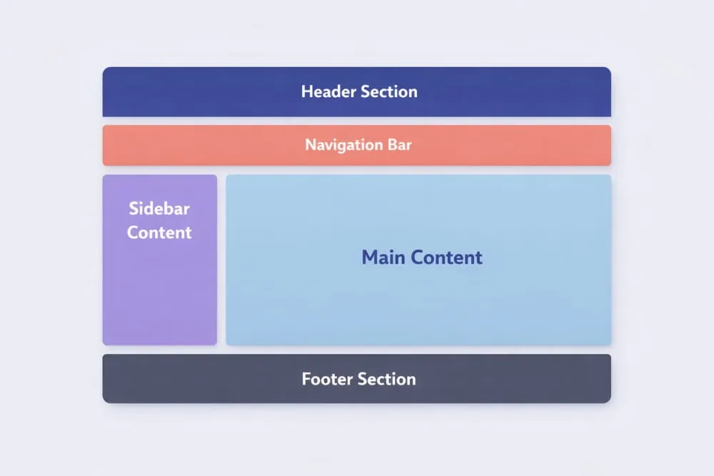
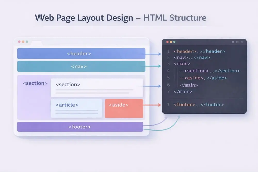
Layout in HTML: Semantic Structure (header/main/section/footer)
Semantic HTML provides the structural language of the web. Instead of relying on generic containers, semantic elements describe the purpose of each area, helping both users and search engines understand how the page is organized.
A well-structured layout typically includes:
- <header> Introduces the page with branding, navigation, or key context.
- <main> Contains the primary content unique to that page.
- <section> Groups related ideas into meaningful blocks, improving scanability.
- <footer> Offers secondary navigation and supporting information.
Using these elements creates a hierarchy that mirrors your design intentions. For example, when someone navigates a page with assistive technology, semantic structure helps them move through content logically rather than encountering a collection of unrelated containers.
Strong web page layout design HTML begins with this clarity. When the underlying code reflects the visual flow, the entire experience becomes more cohesive and easier to maintain.
Common Layout Approaches (Flex/Grid Conceptually)
Modern layouts rely heavily on flexible systems that adapt to different screen sizes while preserving structure. Two widely used approaches support this adaptability without unnecessary complexity.
Flexible Row-Based Layouts
Flex-style structures excel at arranging elements in a single direction, either horizontally or vertically. They are particularly useful for navigation bars, card rows, and evenly spaced components because they dynamically distribute space.
Grid-Based Layouts
Grid systems provide more control by organizing content into rows and columns simultaneously. This makes them ideal for complex interfaces such as dashboards, galleries, or multi-section homepages where alignment is critical.
Rather than choosing one method exclusively, many designers combine both to achieve balance. The key is consistency: when your HTML web page layout follows a predictable structure, updates become easier, and the interface remains visually stable across devices.
Layout HTML Web Page Design Examples (Homepage + Simple Content Page)
Reviewing layout HTML web page design examples can help clarify how the structure translates into real-world pages. While each site has unique goals, effective layouts tend to follow familiar patterns.
Homepage Example
A typical homepage structure might begin with a header for navigation, followed by a hero section inside the main area. Supporting sections expand on value, introduce trust signals, and guide users toward a clear action. Finally, a footer reinforces orientation with additional links.
This approach works because it aligns with user expectations, visitors immediately understand where to look and what to explore next.
Simple Content Page Example
For informational pages, the layout often prioritizes readability. The main content appears prominently, broken into sections with descriptive headings, while supporting navigation may sit nearby or remain accessible at the top.
These examples demonstrate that effective HTML web page layout is less about complexity and more about logical sequencing. When structure feels familiar, users can focus entirely on the message.
Responsive Layout Rules (Breakpoints, Stacking, Container Widths)
Modern users access websites from a wide range of devices, making responsiveness a fundamental requirement rather than an optional enhancement. A responsive layout ensures that content remains clear and navigable across screen sizes.
Breakpoints help determine when the layout should adjust. As screens narrow, multi-column structures often transition into stacked sections to preserve readability.
Stacking behavior should follow priority. Essential content appears first, while secondary elements move below without disrupting flow.
Container widths also influence comfort. Lines of text that stretch too wide can strain the eye, while overly narrow containers create awkward breaks. Balanced widths support smoother reading across devices.
By planning responsiveness early, your HTML web page layout design avoids the need for reactive fixes later. The result is a layout that feels intentional everywhere, from large monitors to handheld screens.
Implementing structure through HTML transforms design concepts into usable experiences. When semantic organization, flexible layout methods, and responsive rules work together, your layout HTML web page design becomes both durable and user-friendly, ready to support growth as your site evolves.
Web Page Design Layout Size: What Dimensions Actually Matter
Size plays a quiet but powerful role in shaping how users experience a website. While colors and typography often get more attention, the dimensions behind a layout directly influence readability, visual comfort, and overall usability. A well-proportioned web page design layout ensures that content feels balanced, neither cramped nor overly spread out.
Rather than chasing fixed pixel values, modern layout thinking focuses on proportion and adaptability. Screens vary widely, so the goal is to create dimensions that respond gracefully while maintaining structure. When sizing decisions are intentional, users can scan, read, and interact without friction.
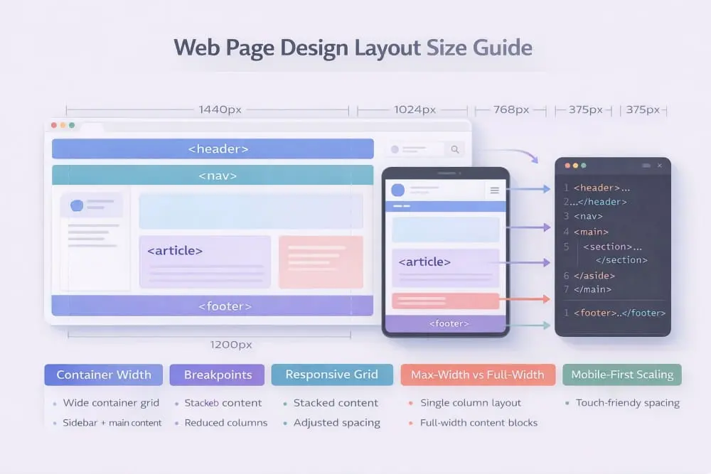
Below are the key sizing factors that help transform an average layout into one that feels polished and effortless.
Container Widths and Readability (Line Length)
Container width determines how far the eye must travel when reading text. If lines stretch too wide, readers lose their place easily; if they are too narrow, the reading rhythm becomes choppy. Striking the right balance is essential for comfortable consumption.
Most high-performing layouts favor moderate-width containers that keep line length within a readable range. This allows users to move naturally from one line to the next without fatigue. It also improves scanning behavior, which is especially important for digital environments where attention spans are limited.
Readable containers also create visual focus. Instead of letting content drift across the screen, they establish a defined area that anchors the page and makes information easier to process. When evaluating web page design layout size, readability should always take priority over filling available space.
Spacing Scale (Consistent Gaps)
Spacing is more than decorative breathing room; it is a structural tool that organizes information and signals relationships between elements. Consistent gaps help users understand which pieces of content belong together and where one section ends and another begins.
A spacing scale introduces rhythm. For example, using predictable increments for margins and padding creates harmony across the page, making the layout feel intentional rather than improvised. Without this consistency, even well-written content can appear disorganized.
Generous spacing also reduces cognitive load. When users are not forced to untangle visually crowded sections, they can focus on meaning rather than structure. In many cases, improving spacing is one of the fastest ways to elevate the perceived quality of a layout.
Image and Section Sizing (Avoid Awkward Rhythm)
Images and sections should complement the page’s flow, not interrupt it. Oversized visuals can dominate attention and push important content too far down, while undersized elements may feel insignificant or disconnected.
The key is proportional balance. Sections should expand naturally in proportion to their importance, creating a cadence that guides the reader forward. Alternating between text and visuals can add variety, but abrupt shifts in size often create visual tension.
Consistency matters here as well. When similar sections share comparable dimensions, the layout develops a steady rhythm that feels easier to follow. This predictability builds comfort, and comfortable interfaces tend to keep users engaged longer.
Ultimately, thoughtful sizing decisions ensure that every element contributes to a cohesive experience. When containers support readability, spacing reinforces structure, and visuals align with the overall rhythm, your layout feels composed rather than accidental.
Understanding what truly matters in web page design layout size allows you to design with intention instead of approximation. By focusing on proportion, consistency, and readability, you create pages that not only look refined but also function seamlessly across viewing environments.
Web Page Layout Design in Photoshop (Workflow for Layout Mockups)
Before a layout becomes live code, many designers map structure visually to test balance, branding, and Hierarchy. Web page layout design in Photoshop provides a controlled environment to refine composition without worrying about technical constraints too early in the process.
While modern design tools vary, Photoshop remains a practical option for high-fidelity mockups, especially when detailed branding, imagery, and typography need careful adjustment. Used strategically, it helps transform wireframes into polished visual blueprints that clearly communicate layout decisions.
The goal of a mockup is not decoration alone. It is to validate structure, spacing, and visual flow before development begins.
When Photoshop Mockups Help (Stakeholder Previews, Branding)
Photoshop mockups are especially useful when collaboration is involved. Clients and stakeholders often respond better to realistic visuals than abstract wireframes. A well-presented layout preview allows decision-makers to see how messaging, imagery, and structure come together in context.
Mockups also support brand alignment. Designers can test typography scales, spacing systems, and visual emphasis while ensuring consistency with established identity guidelines. This step prevents costly revisions during development.
For complex homepages or visually rich landing pages, creating a detailed layout preview helps clarify expectations early. Instead of debating the structure during implementation, teams can first approve a finalized visual direction.
In this way, web page layout design in Photoshop acts as a communication bridge between concept and code.
A Simple PSD Layout Workflow (Grid, Typography, Components)
A structured workflow keeps Photoshop mockups efficient and organized. Rather than designing freely without constraints, professionals rely on consistent systems.
1. Establish a Grid: Begin by defining a grid that mirrors your intended layout structure. This ensures alignment and balanced proportions throughout the design.
2. Set Typography Hierarchy: Define heading levels, body text styles, and spacing rules early. Consistent typography establishes visual Hierarchy and improves clarity across sections.
3. Build Reusable Components: Design modular elements such as buttons, cards, navigation bars, and content blocks as repeatable components. This keeps the layout consistent and simplifies adjustments later.
4. Refine Visual Balance: Evaluate spacing between sections, alignment of images, and emphasis of calls to action. The mockup should reflect the rhythm and structure planned during the wireframing stage.
By following a systematic approach, your layout remains clean and adaptable. Instead of layering random visual elements, each component supports the overall structure.
Export Handoff Tips (What Developers Need From the Design)
A strong mockup is only valuable if it translates smoothly into implementation. Clear handoff reduces confusion and speeds up development.
When preparing files:
- Organize layers logically and label them clearly.
- Keep layout elements grouped by section.
- Provide spacing measurements and grid specifications.
- Document font styles and hierarchy rules.
- Highlight interactive elements such as buttons and navigation states.
Developers need clarity more than decoration. When the structure is easy to interpret, translating the design into functional HTML becomes straightforward.
Ultimately, web page layout design in Photoshop should serve as a precise blueprint rather than just a visual showcase. When mockups prioritize Hierarchy, consistency, and structured handoff, they become powerful tools that support both creative vision and technical execution.
Sample Web Page Layout Design (Annotated Examples)
Understanding structure becomes much easier when you can visualize how strong layouts are assembled. Reviewing a sample web page layout design helps bridge the gap between theory and real-world execution by showing how sections connect, how Hierarchy guides attention, and how users move naturally through a page.
Rather than copying a layout exactly, the goal is to recognize the strategic decisions behind it, why certain elements appear first, how spacing supports readability, and where calls to action fit within the flow. When these choices are intentional, the page feels intuitive from the moment it loads.
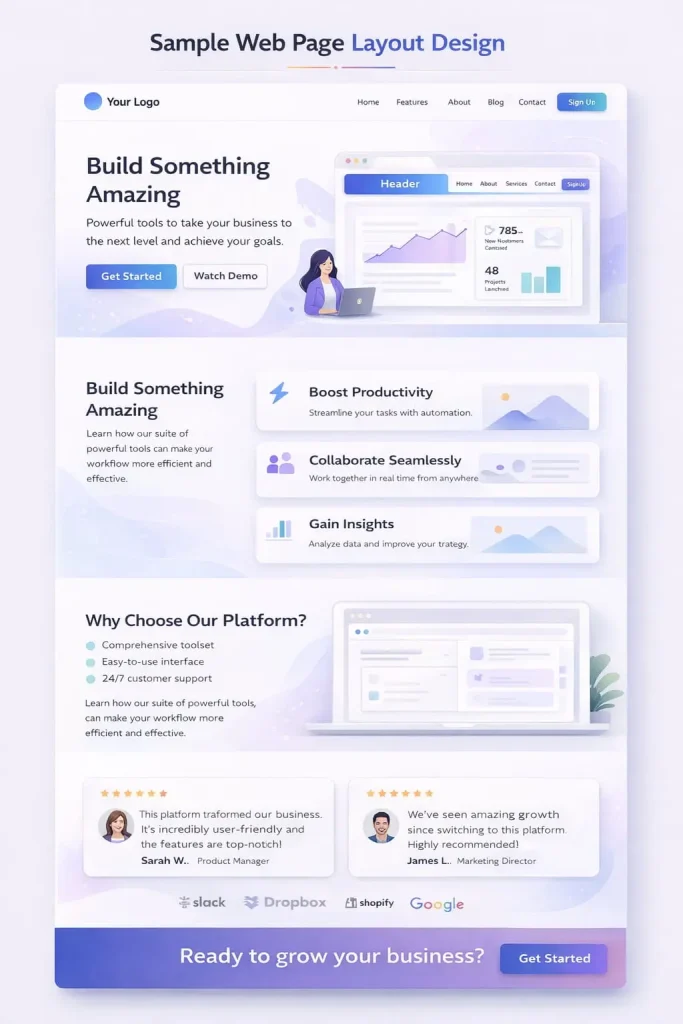
Below are two practical breakdowns that highlight what effective layouts typically prioritize.
Sample Homepage Layout Breakdown
A homepage must orient visitors quickly while building confidence in what they are seeing. Strong layouts focus on clarity first, persuasion second.
1. Header With Streamlined Navigation: The page usually begins with a clean header that establishes identity and provides straightforward navigation. Simplicity is critical here, too many options can dilute focus.
2. Hero Section With Immediate Context: The hero introduces the site’s purpose through a clear headline and supporting message. Visitors should understand what the site offers within seconds, without needing to interpret vague language.
3. Value-Focused Sections: After the introduction, structured content highlights benefits or key offerings. These sections are typically designed for scanning, using balanced spacing and clear headings.
4. Trust Signals: Testimonials, recognitions, or measurable outcomes reinforce credibility. Placing these elements mid-page works well because users often seek reassurance before continuing.
5. Guided Next Step: A visible call to action encourages deeper engagement once interest has been established.
6. Footer for Orientation: The layout closes with a footer that provides secondary navigation and supporting details, helping users continue their journey if needed.
What makes this sample web page layout design effective is its logical progression, introduction, validation, and action, mirroring how people naturally evaluate a website.
Sample Inner Page Layout Breakdown
Inner pages serve a different purpose than homepages. Visitors arriving here are often looking for specific information, so the layout must emphasize clarity and efficiency.
- Focused Header: Navigation remains accessible but less dominant, allowing the content to take priority.
- Clear Page Title: A descriptive heading immediately confirms that users are in the right place.
- Structured Content Sections: Information is divided into logical blocks with consistent spacing, making the material easier to scan and absorb.
- Supportive Visual Elements: Images, diagrams, or highlights appear where they enhance understanding rather than interrupt flow.
- Contextual Actions: Calls to action feel more natural when placed after relevant information instead of appearing prematurely.
- Reinforcing Footer: As with the homepage, the footer provides helpful pathways without distracting from the main content.
- A strong inner-page structure respects user intent by removing unnecessary friction. The experience feels direct, organized, and purposeful.
Quick Layout Critique Checklist You Can Run on Any Page
Evaluating a layout does not require complex analysis. A few focused questions can quickly reveal whether the structure supports usability.
Is the purpose clear within the first few seconds?
Users should not have to guess what the page is about.
Does the layout guide the eye naturally?
Headings, spacing, and visual emphasis should create an obvious reading path.
Are the sections logically ordered?
Information should unfold in a way that supports understanding rather than forcing users to search.
Is there enough spacing for comfortable reading?
Crowded layouts often reduce engagement.
Do important actions stand out without competing elements?
Calls to action should feel visible but not overwhelming.
Does the page maintain consistency?
Predictable patterns help users navigate with confidence.
Running this checklist against any sample web page layout design encourages objective evaluation. Instead of relying on personal preference, you begin assessing structure through the lens of usability.
Studying annotated examples deepens understanding of how effective layouts function. Over time, you will start recognizing patterns that consistently improve clarity and engagement, allowing you to design pages that feel organized, trustworthy, and easy to navigate from the very first interaction.
Frequently Asked Questions (FAQ’s)
What is the best web page layout design for a homepage?
The best homepage layout design communicates purpose immediately and guides users to a clear next step. A strong structure typically includes a focused hero section, benefit-driven content, trust signals, and a visible call to action. Clarity and logical sequencing matter more than visual complexity because users should understand the site within seconds of arrival.
How do I choose a layout template that fits my site?
Choose a template based on your primary goal and the type of experience you want visitors to have. Content-heavy sites benefit from readability-focused layouts, while business pages perform well with structured sections that build credibility and encourage action. The right template should support your content naturally rather than forcing it into an ill-fitting structure.
What are the most important web page layout design principles?
The most important principles include clear visual Hierarchy, consistent spacing, logical content flow, and responsive behavior across devices. These elements help users scan information and navigate without confusion. A well-structured layout prioritizes usability first, ensuring that design choices support comprehension rather than distract from it.
How do I build a web page layout in HTML?
Start by organizing the page with semantic elements such as a header, main content area, structured sections, and a footer to establish Hierarchy. Then apply flexible layout methods that maintain alignment and adapt to different screen sizes. Keeping the structure clean and purposeful ensures the layout remains readable, scalable, and easier to maintain.
What web page design layout size should I use for readability?
For strong readability, use container widths that prevent lines of text from becoming excessively long while allowing comfortable scanning. Balanced spacing between sections further improves clarity and reduces visual strain. Instead of relying on fixed dimensions, focus on proportions that adapt smoothly across devices to maintain a consistent reading experience.


)