
If your website isn’t built for mobile first, it’s already behind.
Today, the majority of web traffic comes from smartphones. Google uses mobile-first indexing. Users expect speed, clarity, and seamless navigation on smaller screens. That’s why mobile first responsive web design is no longer a trend; it’s the foundation of modern web strategy.
But what does it actually mean?
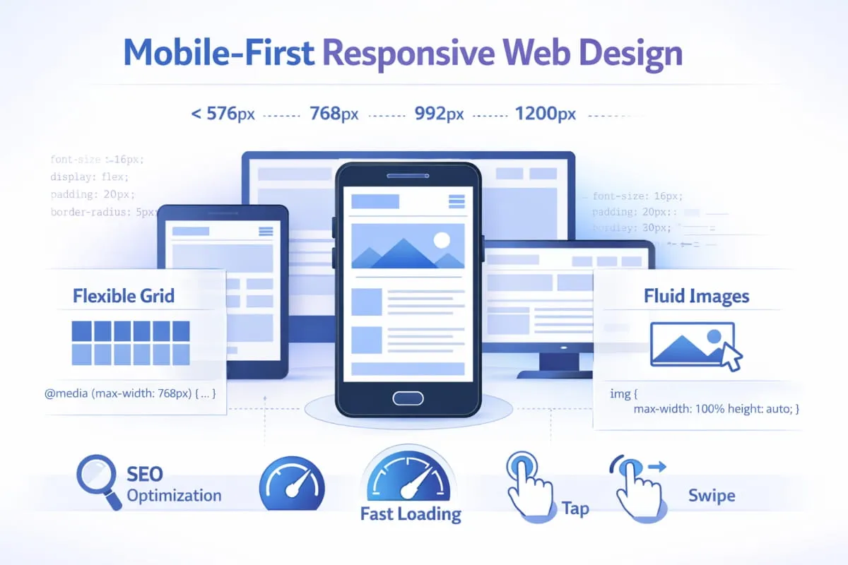
Mobile-first responsive web design is a strategic approach in which websites are designed for small screens first and progressively enhanced for larger devices. Instead of shrinking a desktop layout to fit mobile, you build for mobile users at the core, focusing on speed, clarity, usability, and performance, and expand outward.
This guide is built to give you a complete understanding of:
- What mobile-first responsive web design really is
- How it differs from standard responsive design
- Why it matters for SEO and user experience
- How to implement it effectively
- When it’s better than a separate mobile site or mobile app
Whether you’re a business owner, developer, marketer, or e-commerce operator, this resource will walk you through the principles, benefits, technical foundations, and strategic decisions behind building truly mobile-responsive websites.
By the end, you’ll know not just how mobile responsiveness works, but also how to use it as a competitive advantage.
What Is Mobile Responsive Web Design?
Mobile responsiveness explained (design + Development)
At its core, mobile responsive web design is the practice of building websites that automatically adapt to different screen sizes, especially smartphones and tablets. Instead of creating separate versions of a site for desktop and mobile, a single layout intelligently adjusts its structure, images, text, and navigation to fit the user’s device.
When people ask, “What is mobile responsive web design?” the simplest answer is this: it’s a design and development approach that ensures a website looks, feels, and functions correctly on any screen.
From a design perspective, mobile responsiveness focuses on:
- Flexible layouts that reorganize content for smaller screens
- Readable typography without zooming
- Tap-friendly buttons and navigation
- Clear visual hierarchy optimized for mobile users
From a development perspective, mobile-responsive web development uses technologies such as fluid grids, flexible images, and CSS media queries to control how elements resize and reposition across devices. This is what enables responsive web development for mobile devices to deliver consistent performance without maintaining multiple site versions.
In practice, responsive web design for mobile devices is not just about shrinking content. It’s about prioritizing usability, speed, and clarity so that responsive web design for mobile users feels intentional rather than compressed.
Responsive design vs mobile-friendly (what Google means)
Many websites claim to be “mobile-friendly,” but that doesn’t always mean they are truly responsive.
A mobile-friendly website may display on a smartphone without breaking. Text is readable. Links work. The layout doesn’t overflow the screen. However, the experience may still feel like a scaled-down desktop page.

In contrast, responsive mobile web design dynamically adapts layouts based on screen width. Content blocks stack vertically, images resize proportionally, menus transform into touch-friendly navigation, and spacing adjusts for readability. The experience is designed specifically for different devices, not just tolerated by them.
Google favors responsive design because it uses a single URL and consistent HTML across devices. This makes crawling, indexing, and ranking more efficient compared to maintaining separate mobile domains. That’s why responsive web design best practices for mobile are widely recommended in SEO strategies.
In short:
- Mobile-friendly = works on mobile
- Mobile responsive = built to optimize the experience on mobile
That distinction matters for both users and search engines.
How responsive web design works across devices (mobile + desktop)
A strong mobile- and desktop-responsive web design strategy ensures that a single website adapts smoothly from small smartphone screens to large desktop monitors.
Here’s how it works:
- Fluid grids – Layouts are built with relative units (e.g., percentages) rather than fixed pixels, allowing elements to resize naturally.
- Flexible media – Images and videos scale within their containers to prevent overflow or distortion.
- CSS media queries – These define breakpoints where the layout changes based on screen width.
This is what allows responsive web design mobile layouts to stack vertically on phones while expanding into multi-column layouts on desktop screens.
Behind the scenes, responsive web development for mobile devices ensures consistent performance across environments. Scripts are optimized, assets are compressed, and layouts are tested for touch and mouse interaction.
The result is a seamless, unified experience: one website that intelligently serves mobile users and desktop visitors alike, without duplicate content, separate URLs, or fragmented maintenance.
That’s the foundation of modern mobile-responsive web development, a flexible, scalable system designed for how people browse today.
Mobile-First vs Responsive Design: What’s the Difference?
Mobile-first approach in responsive web design (principles)
A lot of people assume that mobile-first vs responsive web design is an either/or decision. In reality, they work together, but they start from different priorities.
Responsive web design means your website adapts to different screen sizes. It’s a layout technique.
Mobile-first is a strategy. It means you design the experience for the smallest screen first, then progressively enhance it for tablets and desktops.
So when someone searches responsive web design vs mobile first, the most accurate way to explain it is:
- Responsive design = how a layout adapts
- Mobile-first = where you start and what you prioritize
A mobile first approach in responsive web design usually follows these principles:
- Start with the mobile layout (content hierarchy, navigation, spacing)
- Prioritize speed and usability for mobile users first
- Use progressive enhancement to add complexity as screen size increases
- Keep design decisions rooted in real user behavior (scrolling, tapping, limited attention)
This approach naturally leads to cleaner layouts, better performance, and fewer “desktop-first compromises” that hurt mobile usability.
When mobile-first wins vs when standard responsive is enough
The truth is: not every project needs a hardcore mobile-first strategy.
There are cases where standard responsive design is enough, especially if:
- Your audience is primarily desktop-based (certain B2B tools, internal dashboards)
- The site is simple (a small brochure site with minimal UI)
- You’re working with a limited scope and need fast execution
However, in most modern industries, mobile-first and responsive web design are the stronger long-term moves.
Mobile-first wins when:
- Your traffic is mostly mobile (which is common for most public-facing sites)
- You care about SEO performance and rankings
- You’re building ecommerce, service, or content sites
- You want to reduce bounce rate and improve conversions
- You want a scalable foundation that won’t break as devices evolve
In other words, responsive design makes a site work across devices, but mobile-first makes it compete across devices.
Mobile-first vs responsive web development (practical implications)
The difference becomes even clearer when we shift from design to code.
When people compare mobile-first vs. responsive web development, they’re usually asking about what changes in the build process.
Here’s what happens in practice:
Responsive web development (desktop-first) often looks like this:
- Build the full desktop layout first
- Add breakpoints to “shrink” or rearrange elements for mobile
- Remove or hide desktop features that don’t fit on smaller screens
This works, but it can lead to bloated code, slower mobile performance, and awkward compromises.
Mobile-first responsive web development flips the process:
- Build the mobile layout as the default
- Add breakpoints for larger screens (min-width strategy)
- Enhance layouts with additional columns, richer visuals, and extra UI features only when space allows
This is why responsive web development vs. mobile-first is more than a style debate; it affects performance, maintainability, and scalability.
Ultimately, the best approach for most modern websites is not choosing one over the other. It’s combining them:
Mobile first and responsive web development = a site built from the ground up to be fast, usable, and SEO-ready on every device.
Why Mobile Responsiveness Matters

UX impact (speed, readability, navigation, forms)
The importance of mobile responsiveness in modern web design comes down to one simple reality: mobile users behave differently.
They scroll faster, have less patience, and expect everything to “just work” with a thumb. If your site feels slow, cramped, or difficult to use, users don’t adapt; they leave.
That’s why the benefits of responsive web design for mobile users go far beyond aesthetics. A responsive experience improves the things that matter most on a phone:
- Speed: Mobile-first layouts reduce heavy elements and prioritize fast loading.
- Readability: Text sizing, spacing, and content hierarchy are optimized for smaller screens.
- Navigation: Menus, buttons, and layouts adapt to touch interactions rather than mouse clicks.
- Forms: Responsive forms reduce friction, improve completion rates, and prevent rage-tapping.
From a development standpoint, the benefits of responsive web development for mobile users also include cleaner structure, better performance optimization, and fewer layout-breaking issues across devices.
In short, mobile responsiveness creates a smoother experience, and a smoother experience creates more trust.
Business impact (conversion rate, retention, ecommerce outcomes)
The importance of mobile responsiveness in modern web development is directly tied to revenue.
If your site isn’t mobile-responsive, you’re not just losing “traffic.” You’re losing:
- Leads
- Purchases
- Sign-ups
- Bookings
- Repeat visitors
A mobile user who struggles to read product details, zoom into pricing, or fight through a checkout form won’t “come back later on desktop.” They’ll choose a competitor whose site feels effortless.
This is especially true for e-commerce. Mobile shoppers make quick decisions, and responsive design directly influences:
- Product page engagement
- Add-to-cart rate
- Checkout completion
- Customer confidence
That’s why the importance of mobile responsiveness in web design is not just a UX issue; it’s a business performance issue.
Responsive websites reduce friction, increase retention, and create more conversions from the traffic you already have.
Common failures that hurt mobile users
Most websites don’t fail on mobile because they look ugly; they fail because they create unnecessary friction.
Here are the most common mistakes that weaken mobile responsiveness:
- Slow loading pages due to heavy images, bloated scripts, or poor optimization
- Tiny text and buttons that force users to zoom or misclick
- Overcrowded layouts that feel like a shrunken desktop page
- Broken navigation (menus that hide key pages or require too many taps)
- Hard-to-use forms with poor spacing, confusing inputs, or keyboard issues
- Popups that trap the screen, especially on smaller devices
These failures instantly damage trust, and they’re exactly why the importance of mobile responsiveness in web development continues to grow.
Because mobile is no longer a “version” of your website.
Mobile is the default experience.
And if that experience is weak, everything else, SEO, branding, conversion, suffers with it.
SEO and Google Guidance for Responsive Websites

Responsive web design for mobile SEO (crawl, index, signals)
Search visibility today is heavily influenced by how your site performs on mobile. Google primarily uses mobile-first indexing, which means it evaluates the mobile version of your site before the desktop version. That makes responsive web design for mobile SEO a foundational strategy, not an optional enhancement.
A properly built responsive website uses a single URL and consistent HTML across devices. This simplifies crawling and indexing, prevents duplicate content issues, and consolidates ranking signals like backlinks and engagement metrics. From a technical perspective, responsive web development for mobile SEO ensures that page speed, structured data, internal linking, and content hierarchy remain intact across screen sizes.
When your layout adapts cleanly without hiding critical content or breaking navigation, search engines can better understand your pages. That clarity strengthens ranking signals and improves overall discoverability.
How to align with Google Search Central’s mobile-friendly guidance
Google has consistently recommended responsive design as its preferred configuration. Following Google Search Central’s responsive web design mobile-friendly guidance means building a site that delivers the same core content and functionality to all users, regardless of device.
This includes maintaining consistent, structured data, ensuring images scale properly, avoiding blocked resources, and ensuring interactive elements work smoothly on touchscreens. Google Search Central’s responsive web development mobile-friendly recommendations also emphasize proper viewport configuration and performance optimization.
The goal is not just technical compliance. It is about creating a mobile experience that mirrors the value of the desktop experience without sacrificing usability or speed. When both users and search engines can easily access your content, rankings become more stable and sustainable.
Mobile UX + Core Web Vitals basics (what to prioritize)
SEO performance is no longer just about keywords and backlinks. User experience metrics now play a measurable role in visibility. That is why mobile UX and Core Web Vitals should be central priorities in any responsive strategy.
Loading speed must feel instant. Visual stability should prevent layout shifts during page load. Interaction responsiveness should feel immediate when users tap or scroll. These factors influence how Google interprets page quality and user satisfaction.
A well-implemented responsive site prioritizes lightweight design, optimized images, clean code structure, and smooth interaction patterns. When mobile usability and performance align, both search engines and users respond positively.
In practical terms, responsive design supports SEO by simultaneously strengthening technical clarity, user engagement, and performance signals. That alignment is what modern search optimization is built on.
How to Create a Mobile-First Responsive Website
Step-by-step process (content → layout → components → testing)
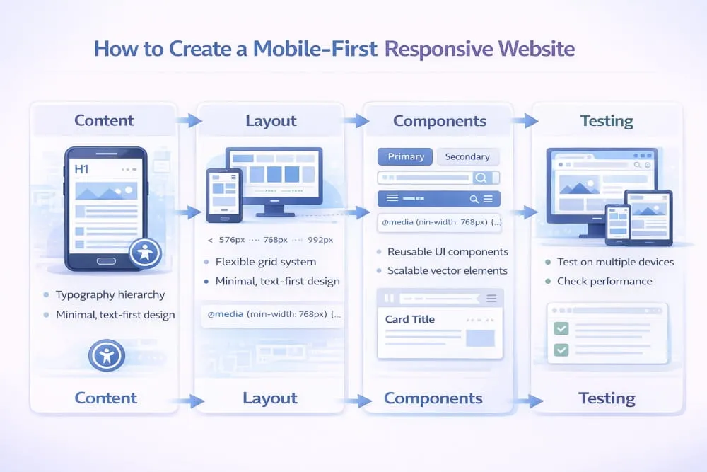
Creating a mobile first responsive web design starts with clarity, not code. The first step is defining the core content. On smaller screens, space is limited, so only the most important information should appear first. This forces better content hierarchy and sharper messaging.
Once content priorities are clear, layout comes next. Instead of designing for a wide desktop canvas, structure the page vertically for natural scrolling. A strong web mobile-responsive design focuses on readable typography, generous spacing, and a simple visual flow. From there, components such as buttons, forms, images, and cards are designed specifically for touch interaction.
The development phase translates that structure into flexible code. Creating a mobile first responsive web development framework means using scalable grids, adaptive images, and clean CSS breakpoints. Finally, testing is critical. Responsive web design on mobile must be validated across real devices, not just resized browser windows. Performance, usability, and layout stability should all be checked before launch.
Mobile-first layout strategy (progressive enhancement)
The foundation of responsive web development on mobile is progressive enhancement. This means the mobile layout is the default experience, and larger screens receive additional enhancements rather than reductions.
In practice, this approach improves performance because smaller devices load only what they need. As the screen width increases, extra layout columns, richer visuals, or expanded navigation can be layered in. Responsive web design mobile optimization works best when enhancements are intentional instead of automatic.
This strategy also improves maintainability. Mobile-responsive web development systems built from a mobile-first base are typically cleaner and easier to scale. Rather than hiding complex desktop elements on small screens, you build upward with purpose.
Navigation patterns that work on mobile (menus, sticky CTAs)
Navigation is often where mobile experiences fail. Effective web design and mobile-responsive layouts simplify access to key actions. Menus must be easy to open, clearly structured, and optimized for thumb reach.
Sticky calls to action can improve engagement when used carefully. On mobile, keeping a primary action visible without overwhelming the screen supports usability and conversions. Responsive web design mobile optimization should also ensure that dropdowns, filters, and search bars function smoothly without lag or layout shifts.
For businesses updating older platforms, building a responsive web design mobile version of an existing website often requires completely rethinking the navigation. The same applies to responsive web development, mobile versions of existing website projects, where legacy desktop structures must be simplified for clarity and speed.
Ultimately, creating a mobile first responsive web design is about building for real-world behavior. When structure, Development, and navigation are aligned around mobile users first, the result is a fast, adaptable, and future-ready website.
Mobile Optimization Essentials (Design + Development)
Responsive typography and spacing (readability rules)
Strong mobile optimization begins with readability. On smaller screens, text that looks balanced on a desktop can quickly feel cramped or overwhelming. That is why understanding responsive web design for mobile sizes is critical. Font sizes must scale naturally across devices, maintaining clarity without forcing users to zoom.
Spacing plays an equally important role. Margins and padding should expand or contract depending on the responsive web design mobile width, so that content never feels compressed. Proper line height, paragraph spacing, and touch-friendly button sizing all contribute to smoother interaction. From a coding perspective, responsive web development mobile size decisions rely on flexible units and scalable layouts rather than fixed pixel values.
When typography and spacing adapt intelligently, users stay engaged longer because reading feels effortless.
Images & media (responsive images, compression, aspect ratios)
Images are often the heaviest elements on a page, and poor optimization can undermine the entire mobile experience. Responsive web design mobile-width strategies ensure that images scale proportionally, rather than overflowing or distorting the layout.
Using adaptive image techniques allows browsers to load the correct image size for each device. This supports faster performance and preserves visual quality. Responsive web development mobile width principles also require developers to maintain consistent aspect ratios so layouts remain stable during loading.
Compression is essential. Large media files increase load times and harm both usability and SEO. Properly optimized visuals create a balance between quality and speed, ensuring that the design remains impactful without sacrificing performance.
Performance basics (rendering, JS weight, lazy loading)
Performance is the backbone of mobile responsiveness. Even well-designed layouts fail if they load slowly or feel unstable. Responsive web design mobile size decisions should minimize unnecessary elements and prioritize essential content first.
On the development side, responsive web development mobile size optimization often focuses on reducing JavaScript weight, streamlining CSS, and improving rendering efficiency. Excessive scripts can delay interactivity, especially on slower mobile networks.
Lazy loading is another key technique. By loading images and media only when they enter the viewport, websites reduce initial load time and improve perceived speed. When rendering is smooth and interactive elements respond instantly, the entire experience feels modern and reliable.
Mobile optimization is not about shrinking a desktop site. It is about building a technically sound, performance-driven foundation that adapts seamlessly across every screen size.
Making an Existing Website Mobile Responsive
Responsive mobile version of an existing website (migration plan)
Transforming an older site into a responsive one requires strategy, not just surface-level design changes. Creating a responsive web design mobile version of an existing website starts with auditing the current structure. You need to evaluate layout rigidity, content hierarchy, performance bottlenecks, and navigation complexity before making changes.
The first phase typically involves restructuring the layout using flexible grids and scalable units. Fixed-width containers must be replaced with fluid frameworks that adapt across screen sizes. From a technical perspective, building a responsive mobile version of an existing website often involves refactoring CSS, updating media handling, and improving viewport configuration.
Migration should also prioritize mobile performance. Compressing assets, simplifying scripts, and reordering content for smaller screens ensures the new responsive version delivers both usability and speed.
Common legacy pitfalls (tables, fixed widths, popups, forms)
Older websites were often built under the assumption of desktop-first design. That creates challenges when adapting them for mobile devices. Fixed-width layouts are among the most common issues because they prevent content from scaling properly. Tables used for structural layout can also break responsiveness, causing horizontal scrolling and distorted formatting.
Popups designed for large screens frequently overwhelm mobile displays, blocking content and frustrating users. Forms may include small input fields or poorly spaced labels, making them difficult to interact with on touchscreens.
These legacy patterns must be redesigned rather than resized. Mobile responsiveness requires structural adjustments, not cosmetic shrinking.
Quick wins vs full rebuild (decision framework)
Not every site requires a complete rebuild. Some projects benefit from targeted improvements that modernize layout behavior and improve performance. Quick wins often include updating CSS to flexible units, improving image scaling, simplifying navigation, and optimizing load speed.
However, when a site relies heavily on outdated architecture or rigid frameworks, incremental fixes may create more complexity over time. In those cases, a full responsive rebuild may offer better long-term scalability and cleaner performance.
The decision depends on technical debt, business goals, and future growth plans. Whether through phased optimization or complete redevelopment, the objective remains the same: create a seamless mobile experience that aligns with modern usability and SEO expectations.
Responsive Website vs Mobile App vs Separate Mobile Site
Responsive web design vs mobile app (when each makes sense)
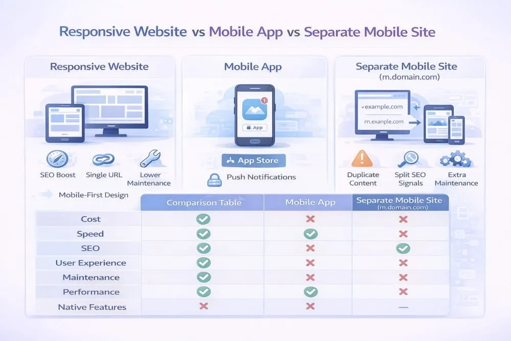
The debate around responsive web design vs mobile apps usually comes down to user behavior and business goals. A responsive website is built to adapt across devices while maintaining a consistent experience, a single URL, and a single codebase. It is ideal for discovery, SEO, content marketing, and conversion-focused journeys in which users arrive via search, social, or ads.
A mobile app is different. Apps are designed for repeat use, deeper personalization, offline access, and device-native features such as push notifications, camera integration, and saved preferences. That is why the comparison between responsive web development and mobile apps is not about which is “better,” but about which is more aligned with how your audience interacts with your product.
For most brands, a responsive website is the foundation. A mobile app becomes valuable when the experience requires long-term engagement and advanced functionality beyond what a browser can comfortably deliver.
Responsive vs separate mobile site (SEO + maintenance tradeoffs)
A separate mobile site typically means maintaining a second version of your website, often on a different structure or URL format. Historically, this was a common solution. But today, responsive web design vs. a separate mobile site is rarely a fair fight.
Responsive design wins because it consolidates everything into one location. One URL, one content source, and one set of ranking signals. That makes SEO stronger and reduces the risk of duplicate content or split authority. It also makes maintenance dramatically easier, since updates, design changes, and new content only need to be handled once.
From a development perspective, responsive web development vs. a separate mobile site also improves long-term scalability. Instead of maintaining two systems that can drift apart, responsive Development keeps the experience unified across mobile and desktop.
Mobile web app vs responsive design/development (clear definitions)
A lot of confusion comes from terminology, especially when comparing a mobile web app vs. a responsive design. A responsive website is primarily a layout and experience strategy. It ensures the site adapts to screen size and device behavior.
A mobile web app, on the other hand, is a web-based application that behaves more like an app. It often includes interactive features, dynamic content, and app-like UI patterns. It may also use advanced browser capabilities, caching, and offline functionality.
That is why mobile web app vs responsive Development is not a replacement comparison. A mobile web app can still be responsive. In fact, the best web apps are built using responsive design principles. Hence, they function smoothly across mobile and desktop devices.
Ultimately, responsive design is the baseline for modern web experiences. Whether you are building a content site, an e-commerce store, or a full web application, responsiveness ensures usability, SEO performance, and a consistent user experience without the complexity of maintaining separate versions.
Platforms for Mobile Responsive Web Design & Development

What platform should mean here (CMS vs frameworks vs builders)
When people search for the best platforms for mobile-first responsive web design, they are usually not looking for a single tool. They are asking what type of foundation will help them build a website that performs well on mobile devices, scales across devices, and remains maintainable in the long term.
In this context, a platform can mean three things. It can be a CMS that manages content and templates, a development framework for building custom experiences, or a site builder for fast publishing. Each option can support responsive design, but the quality of results depends on how well it handles performance, layout flexibility, and mobile usability.
The most important shift is understanding that platforms do not “make” a site responsive by default. The platform only provides the environment. Mobile-first responsiveness still depends on how the design and development decisions are executed.
Selection criteria (performance, flexibility, accessibility, SEO)
The strongest responsive and mobile-friendly web design solutions are the ones that help you create fast, clean, touch-friendly experiences without fighting the system. On mobile, performance is often the deciding factor between a site that ranks and converts and one that loses traffic.
A good platform should allow flexible layout control without forcing heavy scripts or bloated templates. It should support accessible design patterns so navigation, typography, and interactive elements work for all users. It should also make SEO easier by supporting clean URLs, structured content, fast rendering, and mobile-first performance.
From a development perspective, the best responsive and mobile-friendly web development solutions make it easier to optimize performance, control breakpoints, manage responsive images, and avoid unnecessary complexity that slows down mobile devices.
Platform-agnostic checklist (what matters regardless of stack)
No matter which system you choose, the fundamentals of mobile-first responsiveness stay the same. The best platforms for mobile-first responsive web development are the ones that let you build a clean structure, prioritize performance, and create a consistent experience across screen sizes.
A platform is only as good as its ability to support flexible layouts, scalable components, and lightweight output. If the site loads quickly, adapts smoothly, and delivers the same value on mobile as it does on desktop, then the platform is doing its job.
In the end, the goal is not to choose the most popular platform. The goal is to choose the platform that makes it easiest to build a truly mobile-first, responsive, and SEO-ready website.
Mobile-first responsive checklist (UX, performance, SEO, QA)
Mobile-first responsive design is not a single feature you “add” at the end of a project. It is the foundation that determines how users experience your site, how Google evaluates it, and how effectively it converts traffic into results. When done correctly, it creates a unified website that feels natural on mobile, scales smoothly on desktop, and performs consistently across all devices.
The strongest mobile-first responsive websites share the same core qualities. They prioritize clarity in layout, speed in delivery, and usability in every interaction. They are tested on real devices, not assumed to work because the design looks fine in a browser window. And they are built with SEO in mind, so the mobile experience supports crawling, indexing, and ranking rather than quietly weakening it.
Common mistakes to avoid
Most mobile responsiveness problems come from desktop-first thinking. A website can technically “resize” while still feeling uncomfortable to use on a phone. That happens when navigation becomes cramped, text becomes too small, layouts feel overloaded, or key actions require too much scrolling and tapping.
Performance is another common failure point. Heavy scripts, unoptimized images, and unstable layouts can make a responsive site feel slow and unreliable. Even if the design looks modern, mobile users notice the delay instantly. Google does too. True responsiveness is not only about layout, but it is also about delivering a smooth, fast, and consistent experience.
If you only do 5 things priority list
If you want the biggest results with the least complexity, focus on the fundamentals. Set your mobile layout as the default and build from there with progressive enhancement. Keep your content hierarchy clean so the most important information appears first on small screens. Optimize images and remove unnecessary scripts to keep mobile performance fast. Ensure navigation and forms are designed for thumbs, not mouse clicks. Finally, test across real devices to confirm everything works in real-world conditions.
When you get these five priorities right, mobile-first responsiveness becomes more than a design choice. It becomes a competitive advantage that improves UX, strengthens SEO, and increases conversions from the traffic you already have.
Frequently Asked Questions (FAQ’s)
What is mobile-responsive web design?
Mobile-responsive web design is an approach to building websites that automatically adapt to different screen sizes and devices. Instead of creating separate desktop and mobile versions, a single site layout adapts using flexible grids, scalable images, and CSS breakpoints. The goal is to ensure the website remains readable, usable, and fast on smartphones, tablets, and desktops without duplicating content or URLs.
Is mobile-first the same as responsive design?
No, mobile-first and responsive design are related but not identical. Responsive design refers to layouts that adapt across screen sizes. Mobile-first is a design strategy in which the design process begins with the smallest screen and progressively scales up to larger devices. In practice, mobile-first responsive web design combines both ideas by prioritizing mobile users while ensuring the site scales smoothly.
What’s the best screen width to design for?
There is no single “best” screen width. Modern responsive design focuses on flexible ranges rather than fixed device dimensions. Most mobile-first strategies start with a small default layout and add breakpoints based on content needs, typically beginning around common mobile widths and expanding upward. Designing around content behavior instead of specific device sizes creates a more future-proof experience.
Does responsive design help SEO?
Yes, responsive design supports SEO by providing a single URL and consistent content across devices. This simplifies crawling and indexing while consolidating ranking signals, such as backlinks and engagement metrics, since Google uses mobile-first indexing. A well-optimized responsive site improves visibility, user experience, and overall search performance.
Should I build a mobile app instead of a responsive site?
A responsive website is usually the foundation because it supports search visibility, accessibility, and cross-device usability. A mobile app is beneficial when your business requires advanced functionality, offline access, or repeat engagement through features like push notifications. For most businesses, a responsive site comes first, and an app becomes a complementary extension if needed.
How do I make my existing site mobile responsive?
Start by auditing your current layout for fixed widths, large media files, and navigation issues. Replace rigid structures with flexible grids, scalable images, and responsive CSS breakpoints. Optimize performance by reducing heavy scripts and compressing assets. If the site architecture is outdated, a partial redesign or full rebuild using mobile-first responsive development principles may deliver better long-term results.


)